

Remaining
Under "Remaining" fall projects that do not directly fit into another category, but which I have created and would like to showcase. "Remaining" can actually be seen as a synonym for "other." Expect a bit of everything in this category, such as art objects, logos, and various other designs.
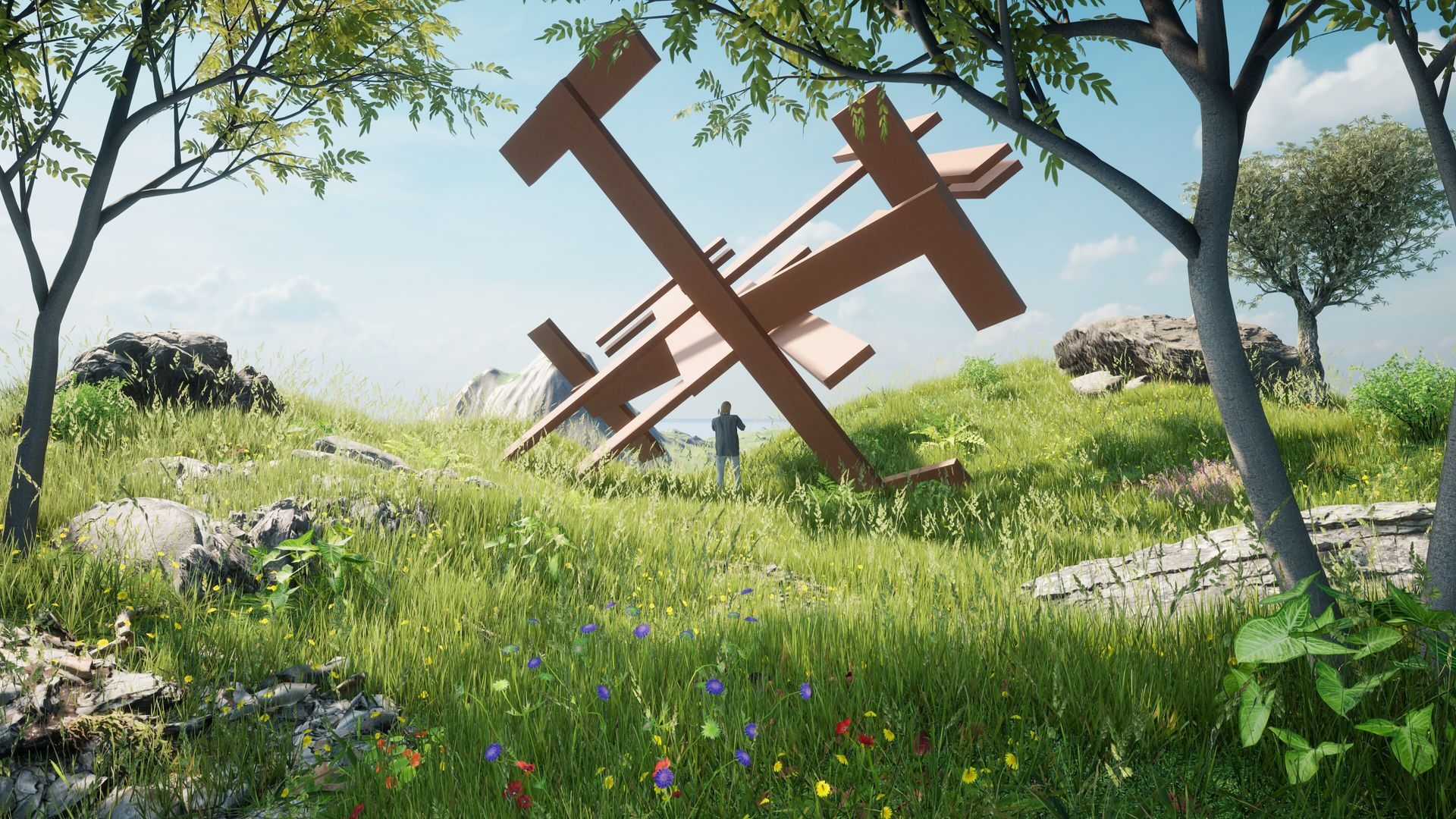
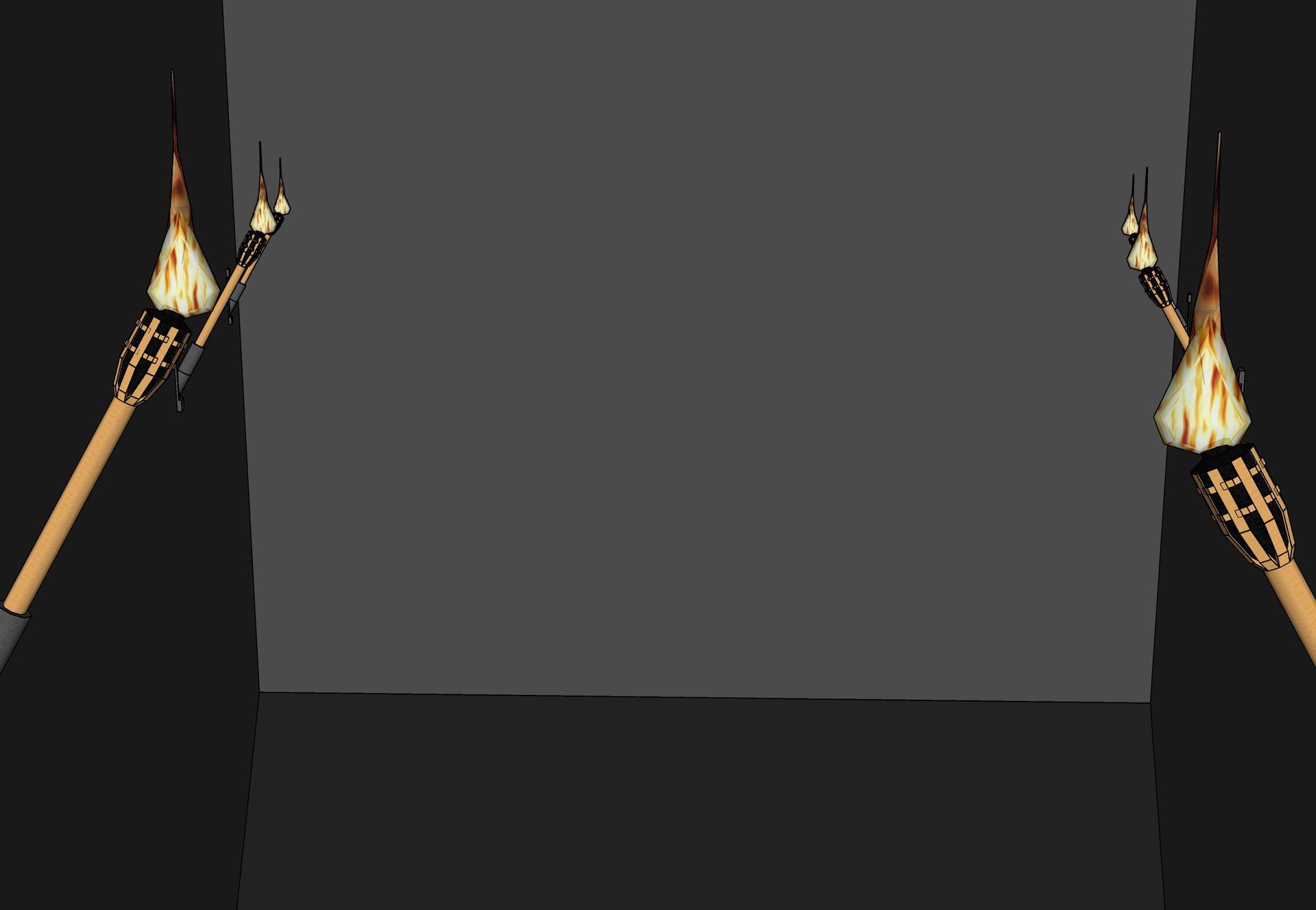
War Monument
The monument rises majestically as a homage to the victims of war on the mountaintop, featuring an oxidized metallic design that evokes the haunting beauty of a spike minefield. The iron spikes emerge from the earth like echoes of the complex history of struggle and grief, serving as a poignant reminder of the scars that wars inflict. Collectively, they create a profound tribute to the indescribable sacrifices made for the sake of peace.
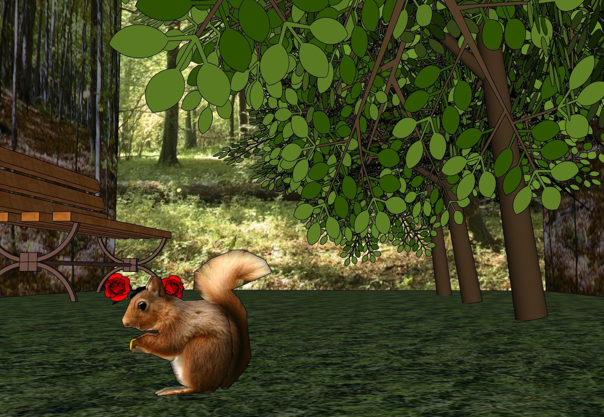
People and animals bank
The People-and-Animals-Bank aims to foster a distinctive bond between humans and animals. This concept is intended to promote interaction and coexistence in a natural, easygoing way. The rounded, fluid form invites communication and socializing, while the multi-tiered structure provides varying levels of comfort for individuals and groups alike.
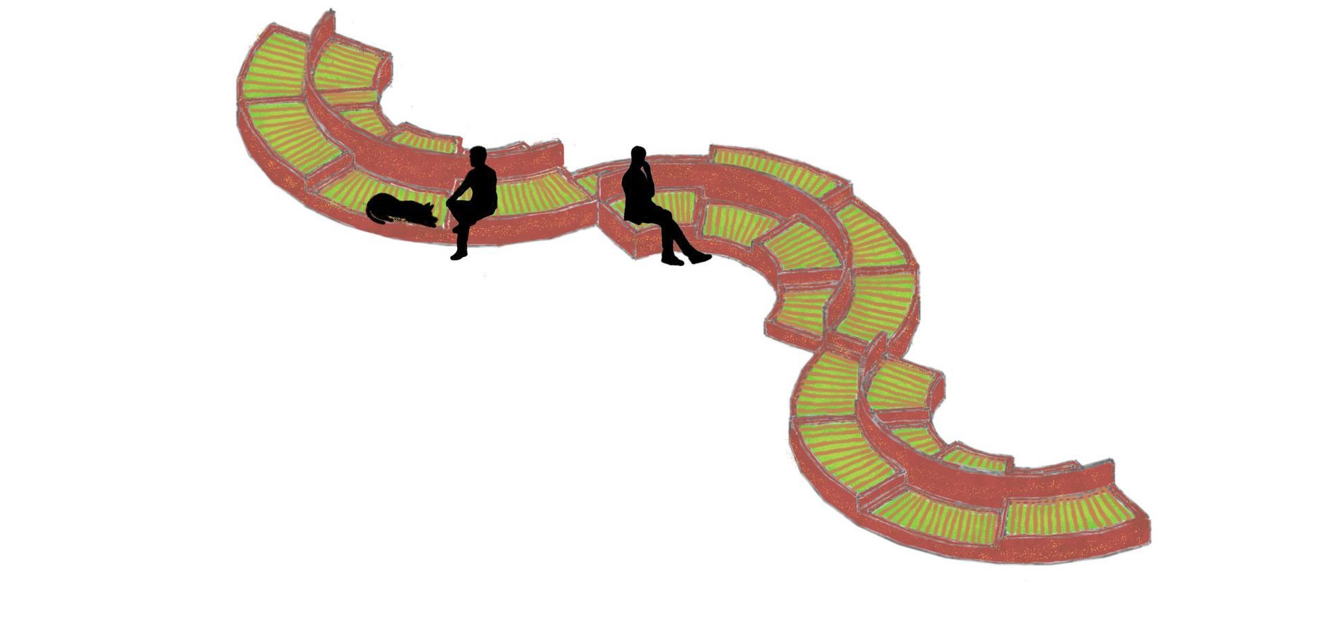
Through the incorporation of natural materials like wood and earthy hues, the bench embodies sustainability while highlighting the synergy between nature and the human habitat. Its design offers seating for people and a cozy nesting area for animals, fostering a harmonious relationship that signifies peace and connection. Consequently, this bench transforms into a dynamic emblem of the mutual respect and bond between humans and animals, rooted in a sustainable and significant design. Ideal for parks, plazas, and various outdoor settings where nature takes center stage.
Expo for war
My intention is to develop an example akin to what is presented on this page, featuring a comic in which the final panel showcases a related concept; I would like to infuse a bit more abstraction into it. This approach is driven by my desire to allow the viewer of this image to engage in open interpretation of its content. Consequently, the depicted objects will not be entirely literal representations of weapons but rather formed from fundamental shapes. At its essence, it primarily addresses the issue of steel wastage in weaponry. This concept emerges from the assignment outlined.
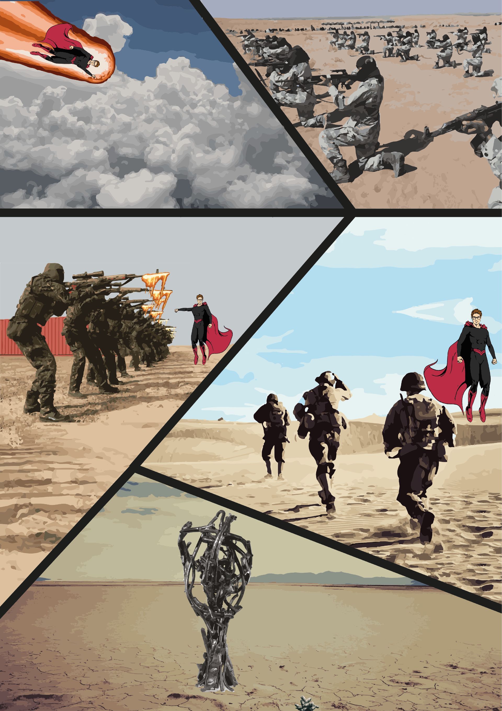
During a project, I delved into the psychology of superpowers and posed the question: "If you could select a superpower, which one would you choose, and how would you wield it?" This inquiry inspired a comic featuring a hero endowed with "Lavagenesis" – the extraordinary ability to manipulate lava. This superhero resolves a war through his power, not by obliterating the weapons, but by transforming them into a monument. This monument stands as a symbol and reminder of the war, serving as a visual tribute to the force that can foster peace while also representing the somber realities of struggle and conflict.
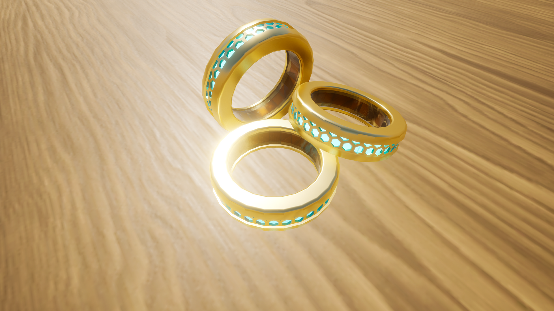
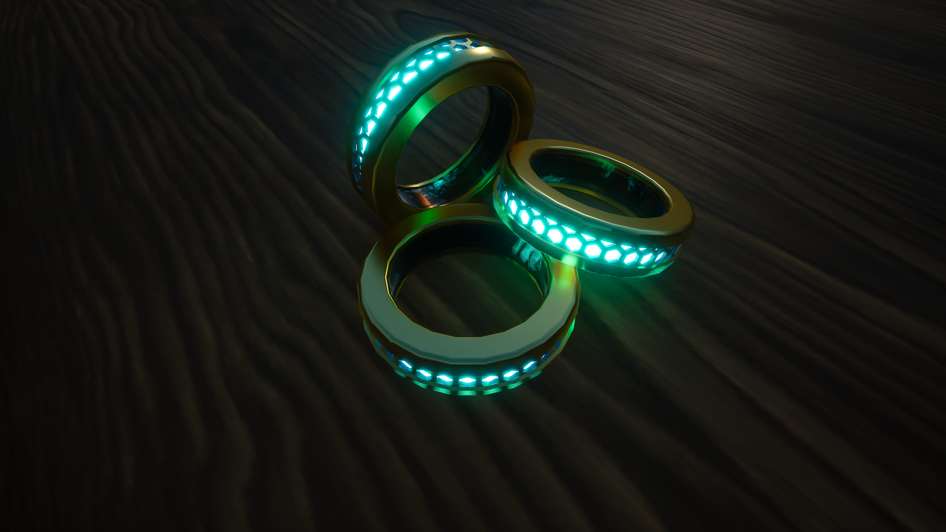
Rings of light
After discovering the existence of nyctophobia, the fear of the dark, I started to contemplate how light could serve as a source of comfort for those affected. My aim was to design something that could accompany them always, without the dependence on bulky lamps or gadgets. A ring appeared to be the ideal solution: compact, portable, and intimate. The inspiration for a constantly glowing ring came from the realization that such an object is not only functional but can also offer solace during dark times. It was my way of bringing a touch of light and security closer to them.
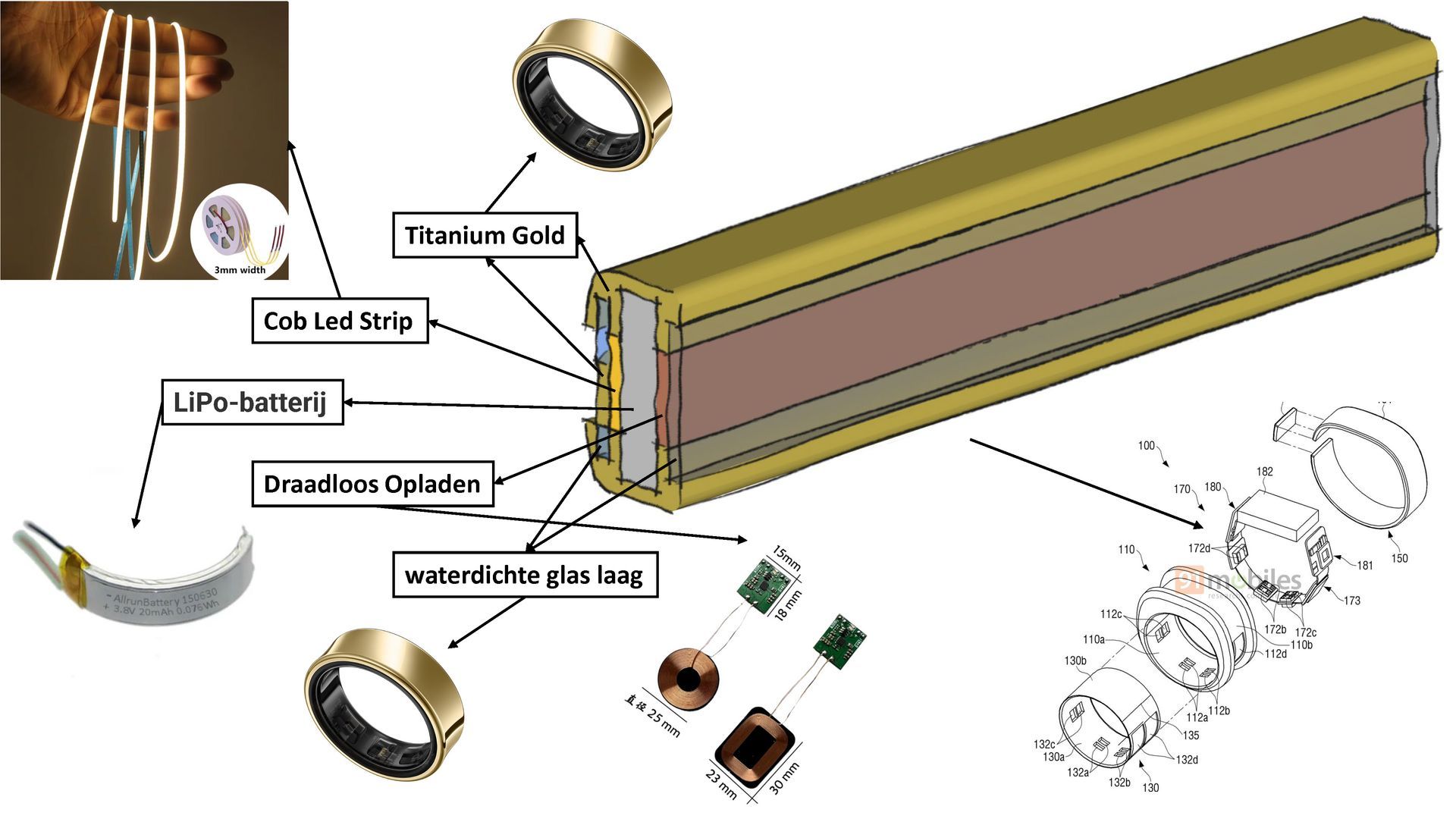
The ring must offer adequate space for the battery and LED system, necessitating a thickness of approximately 5-7 mm. If utilizing smaller batteries, the ring can be slightly more slender, though this may lead to a reduction in battery life. The height of the ring will vary based on the battery and LED configuration, with an additional height of 2-4 mm above the standard ring height typically sufficient for the LED components. Opting for a wider ring, around 6-8 mm, can effectively accommodate all elements within the casing without imparting excessive weight. There are ultra-thin, flexible batteries specifically engineered for wearables such as rings or compact devices; these can be molded to fit inside the ring. If deploying an LED strip, it is likely to be a flexible nano-LED strip, as these are compact enough for a ring design. The ring can be charged through a wireless charging station.
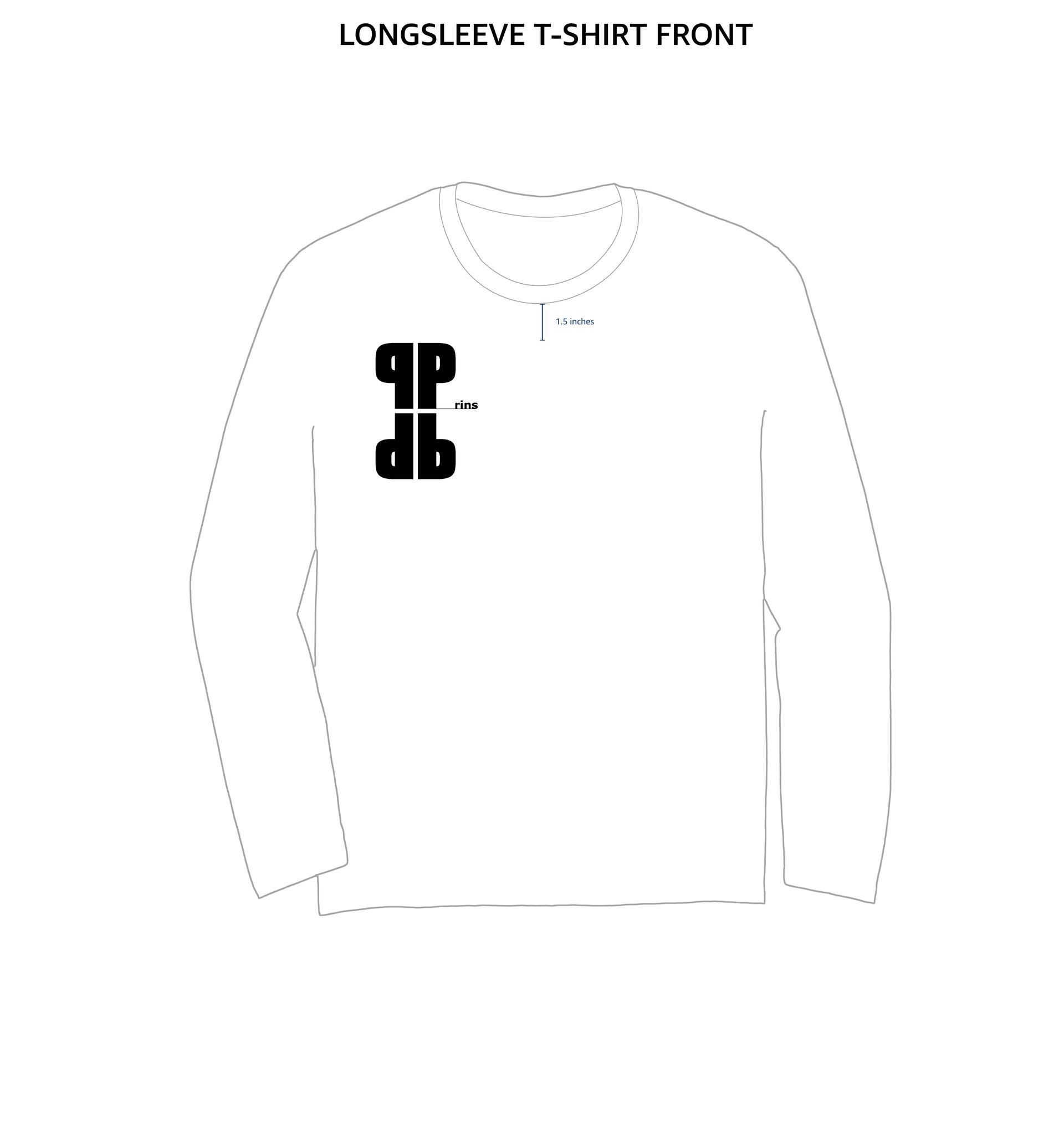
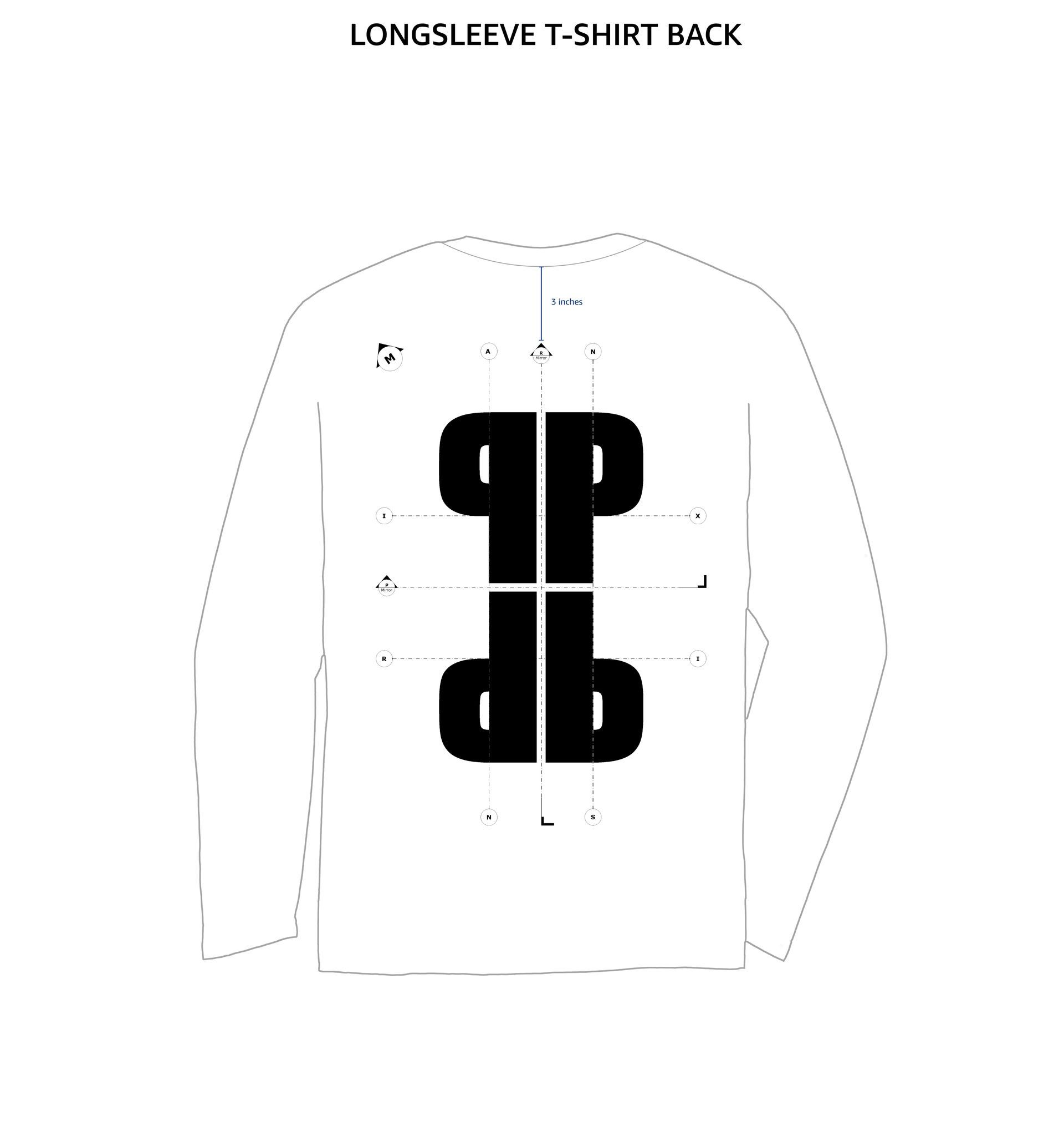
T-Shirt
For this design, I crafted a distinctive print for a T-shirt. It ingeniously weaves in personal touches, including a subtle nod to my name, alongside my fervor for architecture. Central to the design are prominent, mirrored letters 'P', which are positioned at the back of the shirt. The clean lines and geometric composition evoke imagery of blueprints and architectural forms, forging a strong connection to my passion and background in the field. The interplay of black-and-white contrasts accentuates the graphic nature of the design, imbuing it with a timeless elegance. Consequently, the T-shirt transcends mere fashion, serving as a statement that harmoniously blends design with personal identity.
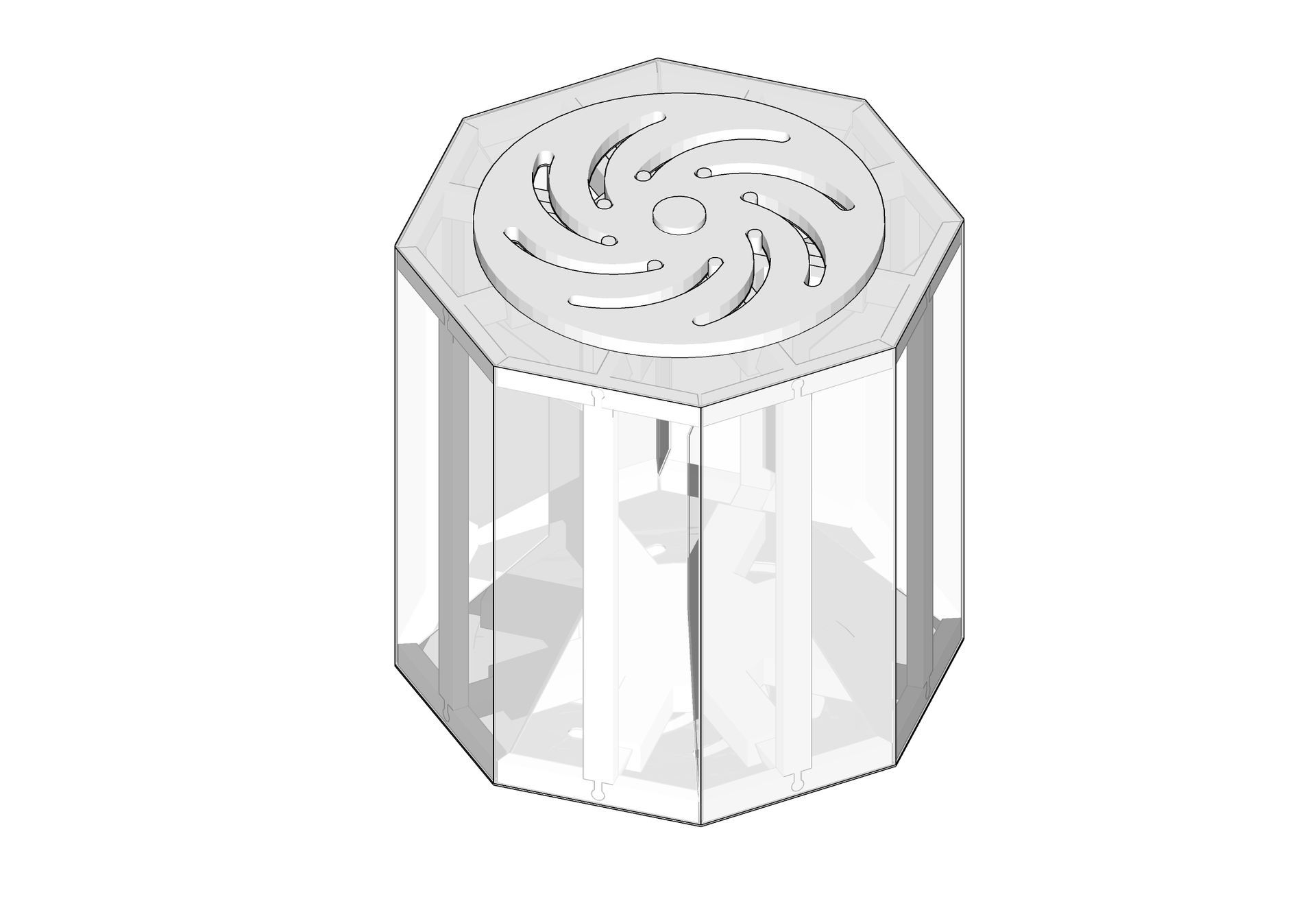
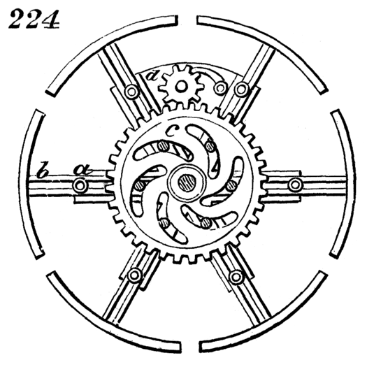
Expanding pulley lamp
This illustrates an expanding disk. By rotating sheave d to the right or left, a corresponding motion is applied to wheel c, which, through its curved slots, either pushes the studs attached to the arms of the pulley outward or draws them inward, thereby altering the size of the disk.
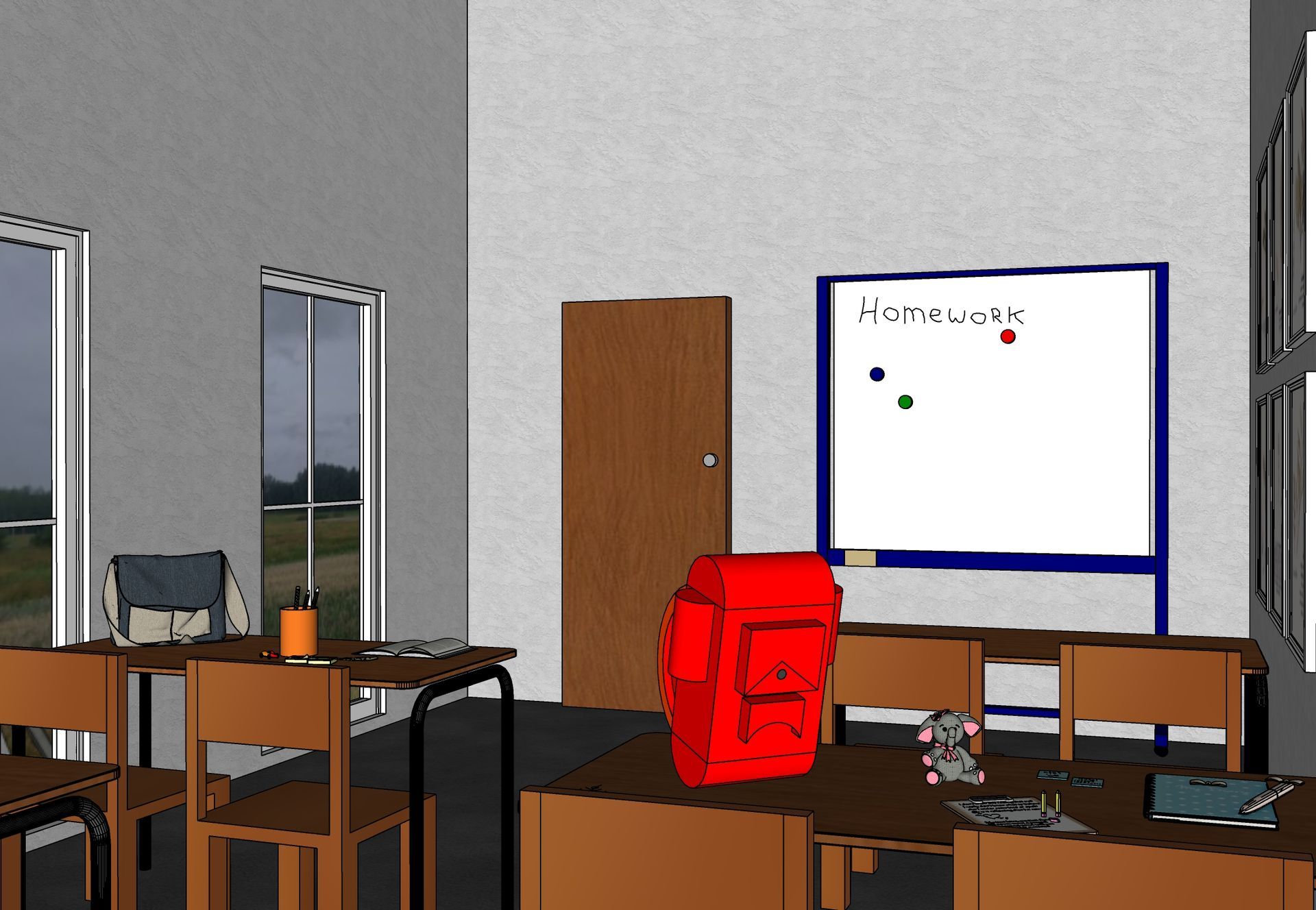
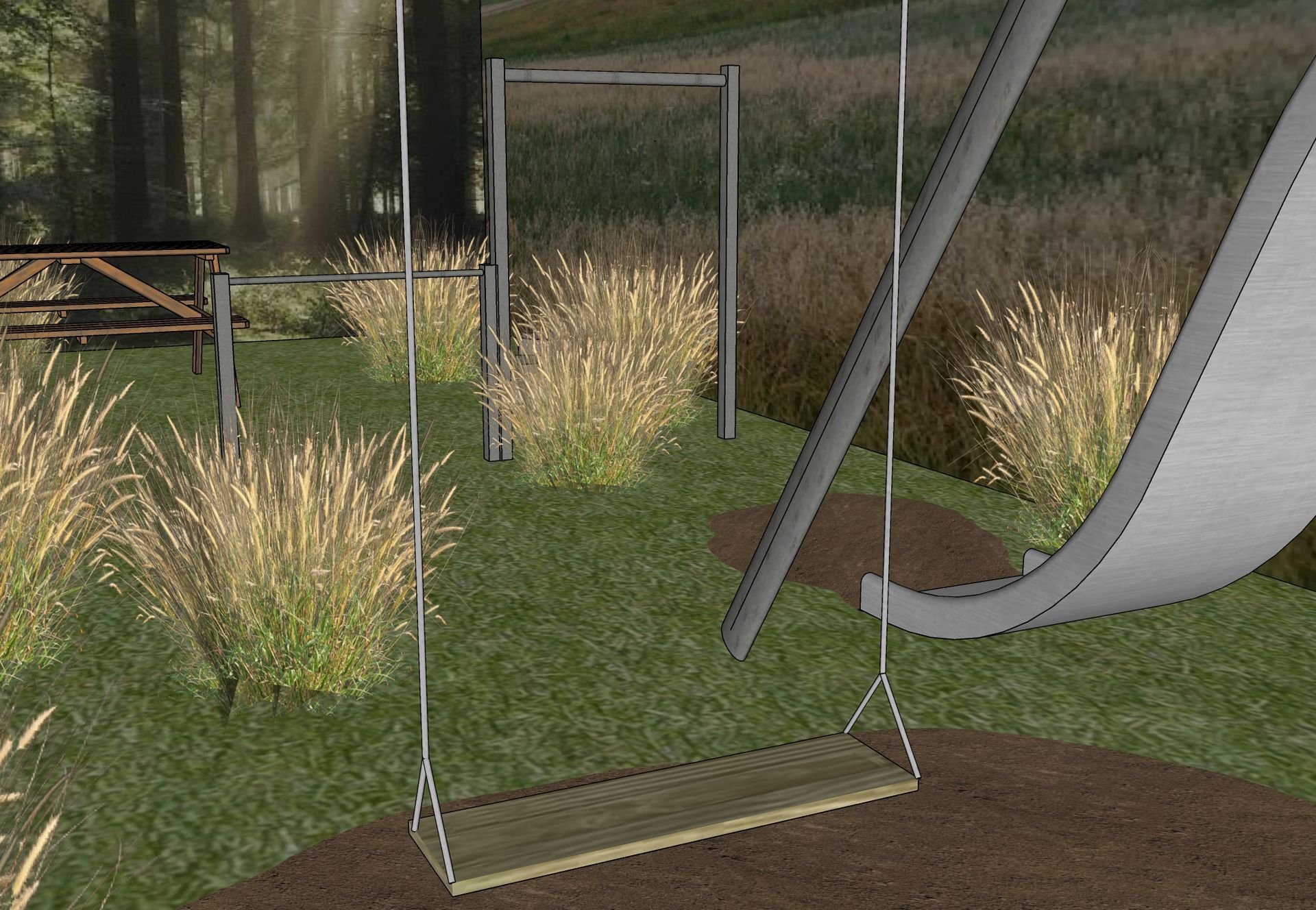
Twister meets trash
Identifying a resolution to the litter issue, anchored in a significant existing challenge recognizable within the community. Transitioning from concept to an actionable project, which can be traced back to an intervention leaving a lasting impression as a central theme.
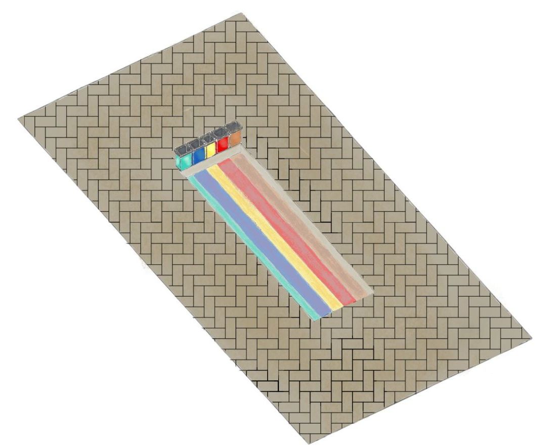
The area was teeming with seagulls that scavenged waste from the bins and scattered it onto the streets alongside trash that was already present, presenting a significant issue that needed addressing. I aimed to design closed trash cans to prevent the seagulls from accessing their contents. There are five distinct waste bins designated for separating refuse, which are managed by the local community and can be utilized by a nearby school for educational lessons on the importance of reuse.
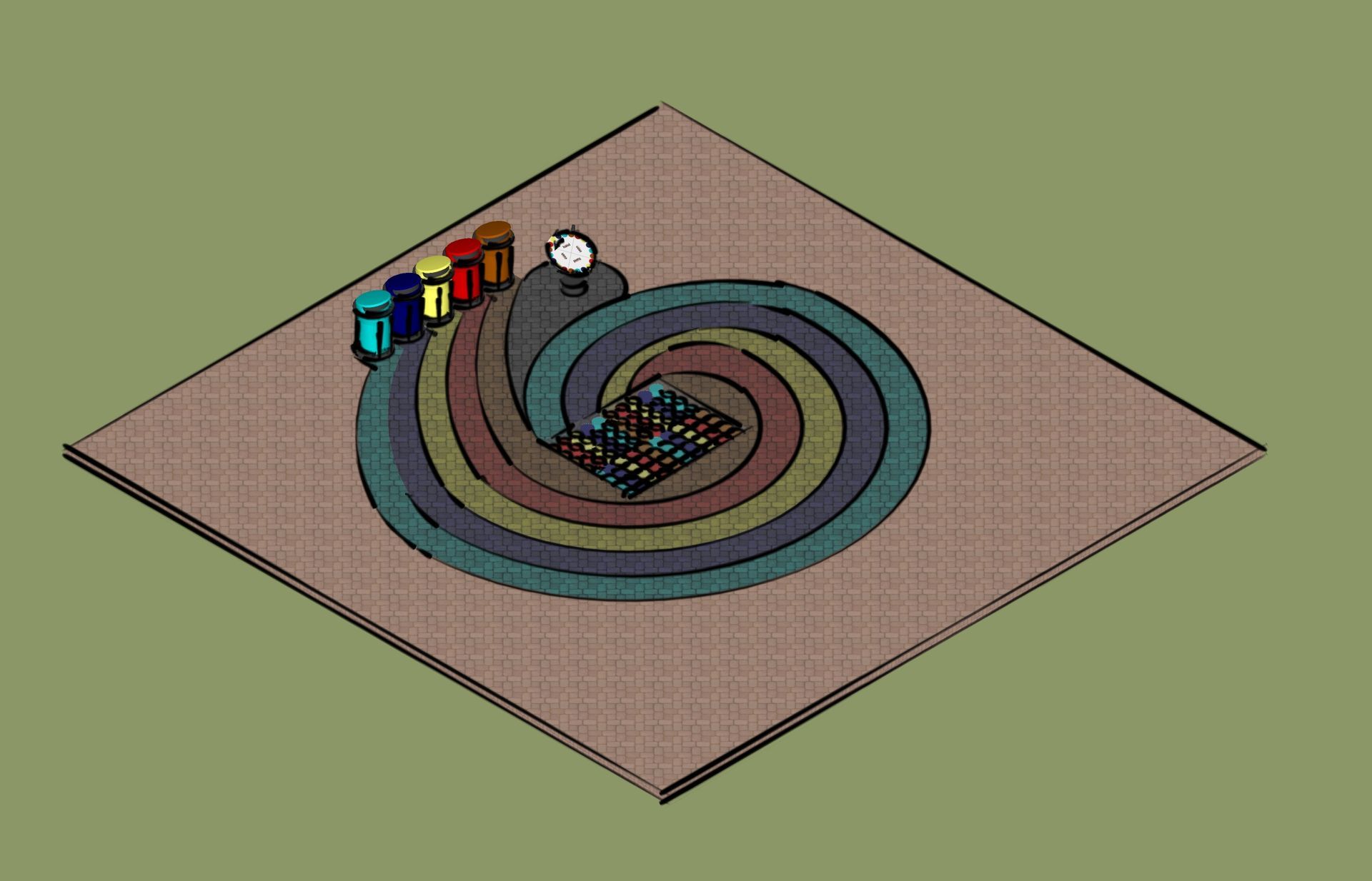
I aim to create an interactive Twister field using leaves gathered from the neighborhood, which I will then embed in the ground and seal with natural epoxy. This idea arises from my passion for collecting waste and repurposing materials to provide them with a new function.
Investigating which plants are suitable for placement and how to guide individuals towards creating a space for gathering and interaction should be influenced by the design. Perhaps there could be elements that encourage people to engage in games or collaborative activities. What are the varying levels of interaction when individuals come together? It might be intriguing to establish distinctions in this regard. Fostering connections between people through shared activities can create layers of relationship, extending to include interactions with animals as well. The essence of the concept steers us toward cultivating diverse forms of engagement and/or tranquility. How can I draw inspiration from existing projects, and to what degree do I wish to implement these ideas?
Train station Overvecht
The approach to the Overvecht train station enhances directional flow for visitors towards the destination. Intertwined tree branches foster a feeling of unity.
These references highlight the different factors that contribute to the enjoyment of a place, including human interaction, accessibility, diversity and inclusivity, green spaces, and urban design. By taking these elements into account when developing a space, one can help foster an environment that is appealing and where people feel a sense of belonging.
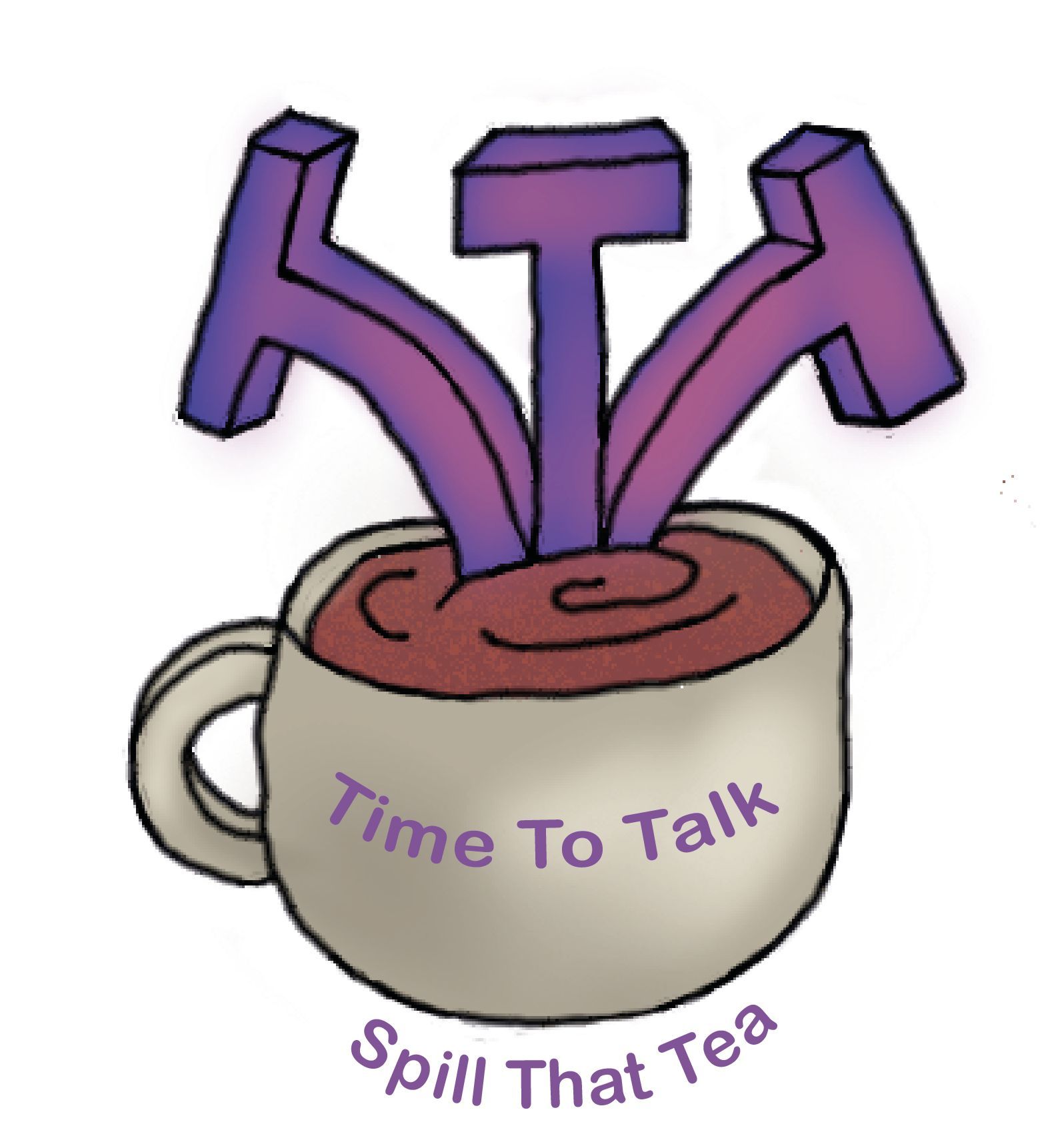
Spill the tea
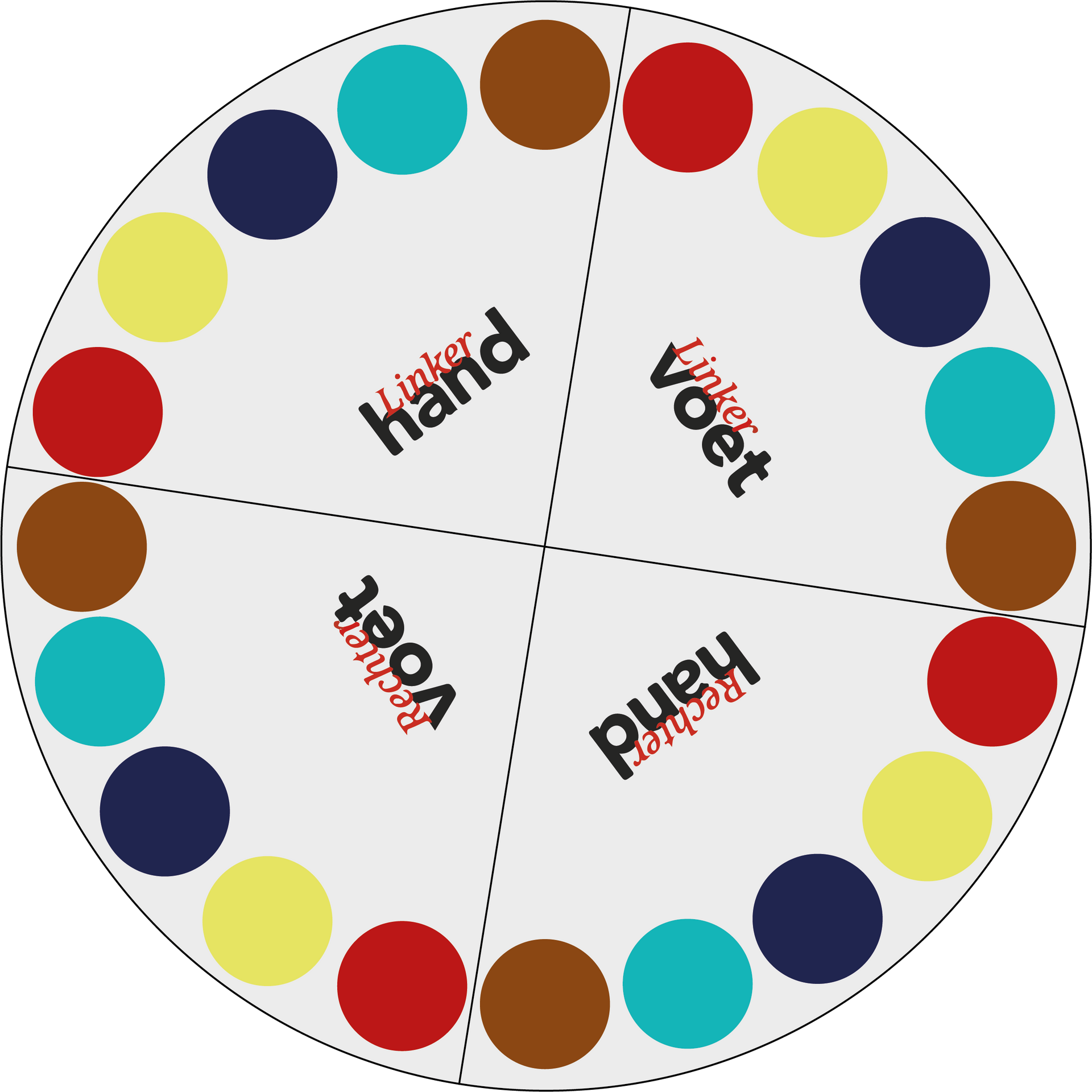
A board game designed to foster connections by exploring one another from unique perspectives grounded in the past, present, and future.
The player whose turn it is responds to the question by writing their answer on their chalkboard. Meanwhile, the other players attempt to predict what the active player would answer and jot it down on their own chalkboards. Make sure your fellow players can’t see your answer! Each player who earns points advances on the board by a number of spaces corresponding to the points they have just scored. Now, it's the next player’s turn, and play continues in a clockwise direction. The player who first reaches 10 points and lands on the final square is declared the winner!
PREPARATION
Open the game board and set it on the table. Position the purple 'past' cards in the purple box, the yellow 'present' cards in the yellow box, and the green 'future' cards in the green box. Set the dice on the table and provide each player with a chalkboard and a piece of chalk. Each player selects a pawn and places it on the starting space.
THE GAME
The player with the most pets begins by rolling the die and selecting a card that corresponds to the die's color. The player then reads the question on the card audibly so that all participants can hear it clearly.
SCORING
You earn 1 point if the guessed answer is familiar or is an answer you could have provided, even if it doesn't match what you wrote on your chalkboard. You earn 2 points if the guessed answer aligns with the answer on your chalkboard, even if it’s not an exact match. You receive 3 points if the guessed answer is identical to what you have written on your chalkboard. Once all players have recorded their answers, the player sitting to the left of the one whose turn it is reveals their answer, followed by the other players in a clockwise manner. Lastly, the player whose turn it is will reveal their answer and award the points accordingly.
Memory Lane
An immersive VR experience featuring a compelling narrative. To engage with the game, players must navigate through all 7 memories of either the girl or the boy, ultimately leading to a pivotal question: answer correctly to ascend to the good, or answer incorrectly to descend to the bad. The first video showcases two individuals enjoying the game, while the second video highlights the accompanying music.
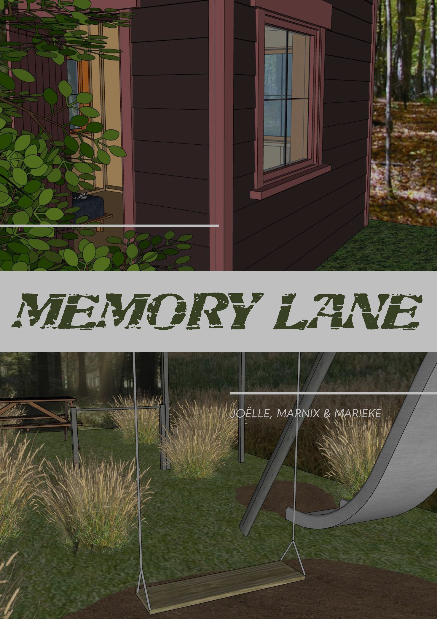
Welcome! Everything will be okay. You will traverse Memory Lane to discover what you’re searching for. If you desire to leave a memory behind, step onto the cross on the floor and close your eyes; soon you will find yourself in a new memory. Follow your heart…
Reshaped Store Shelf
An independent depiction of a supermarket shelf derived from the notion of positive and negative forms. By incorporating a scattering effect, it imparts a sense of distortion.
Achieve a balance that feels as if your mind wields power over it with telekinesis. It presents itself in the form of body parts—not quite right—that offer you direction, unexpectedly akin to traffic signs guiding your way. The lines could resemble a pathway, while the wooden elements symbolize the experiences you encounter throughout life. They represent aspirations, for instance, that you strive to fulfill or tasks you must accomplish to ultimately reach your destination. Tightly bound yet delicate. The hue imparts a sense of demise to the figure, as if it is nearing the end of its life. All elements are flat surfaces that combine to create an entirely three-dimensional shape.
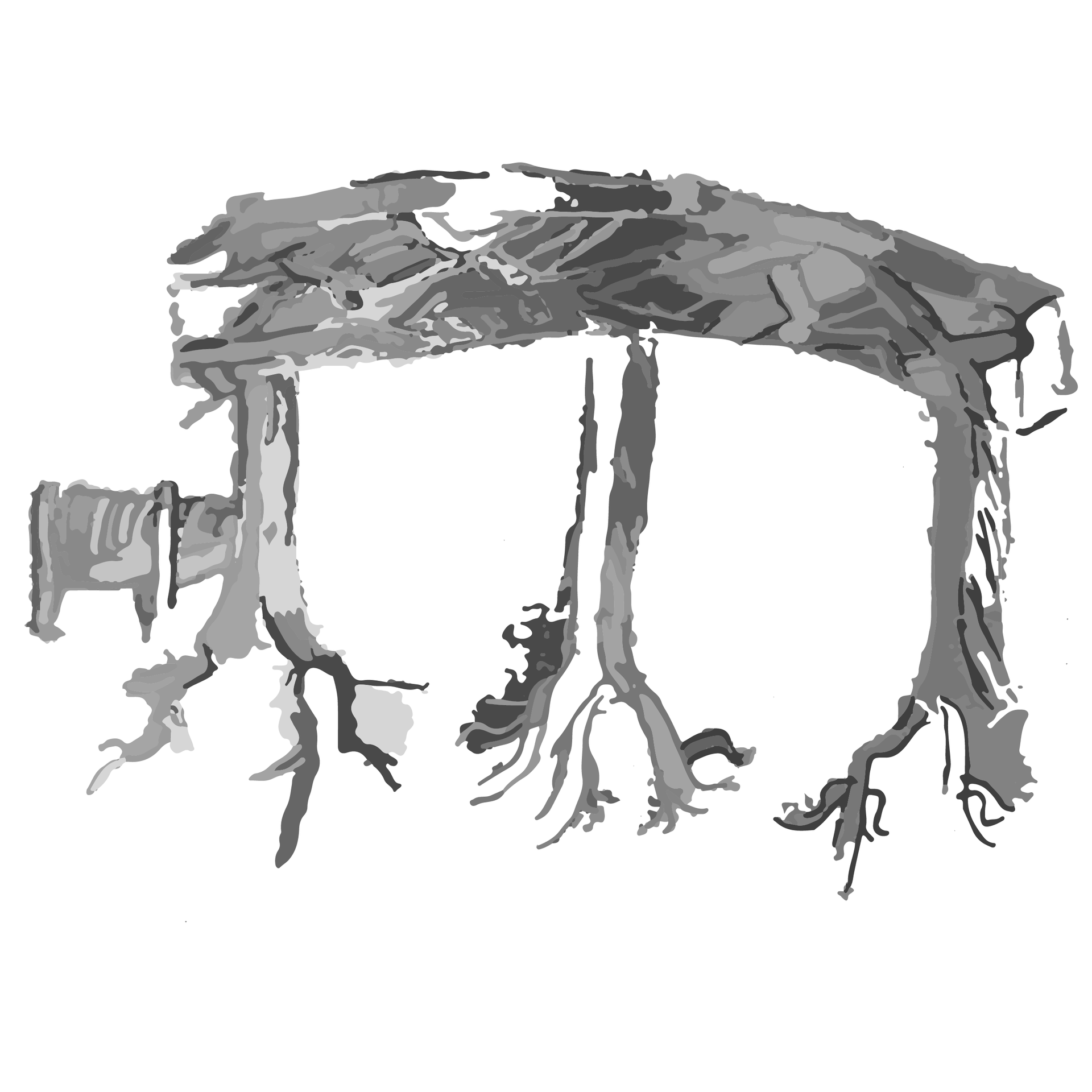
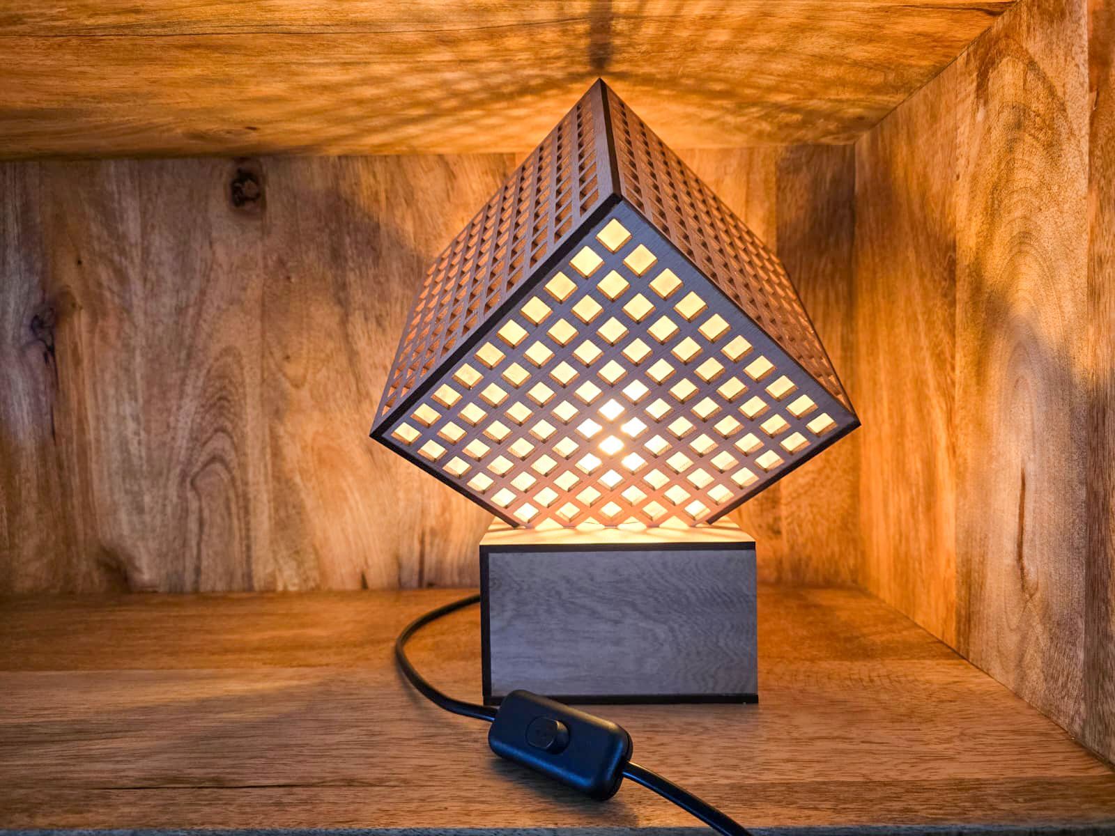
Rem Koolhaas lamp
A lamp of my own design inspired by the work of Rem Koolhaas. This was the starting point for creating this lamp. I examined his design and construction methods, which I have integrated into the lamp.
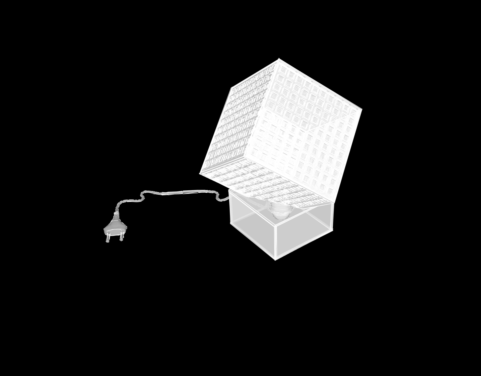
In designing this lamp, I examined his style, design approach, and construction methods, discovering that in his architectural creations, the framework is established first, with the windows placed directly atop it. I aimed to emulate this process by creating a skeleton and subsequently fitting glass behind it, ensuring the framework remains visible. I opted for square windows, reflecting the predominant shape found in many of his buildings. In the Netherlands, his architectural style is regarded as postmodernist. Initially, I incorporated an LED strip that intricately wove through the lamp; however, I later replaced it with a centrally positioned LED bulb.
Remment Lucas Koolhaas, born in Rotterdam on November 17, 1944, is a prominent Dutch architect. In 1975, he established the Office for Metropolitan Architecture (OMA) alongside Elia and Zoe Zenghelis, as well as Madelon Vriesendorp. Before venturing into architecture, Koolhaas gained experience as a journalist and screenwriter, ultimately graduating from the Architectural Association in London. His groundbreaking 1995 publication, S,M,L,XL, encapsulated OMA's projects while exploring the intricate relationship between contemporary society and architecture. Koolhaas presents a truly distinctive viewpoint that emphasizes the evolving urban dynamics worldwide and the impact of retail and consumption in modern life.
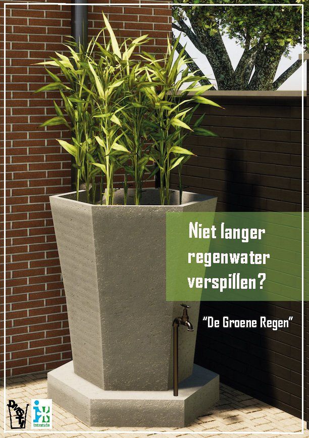
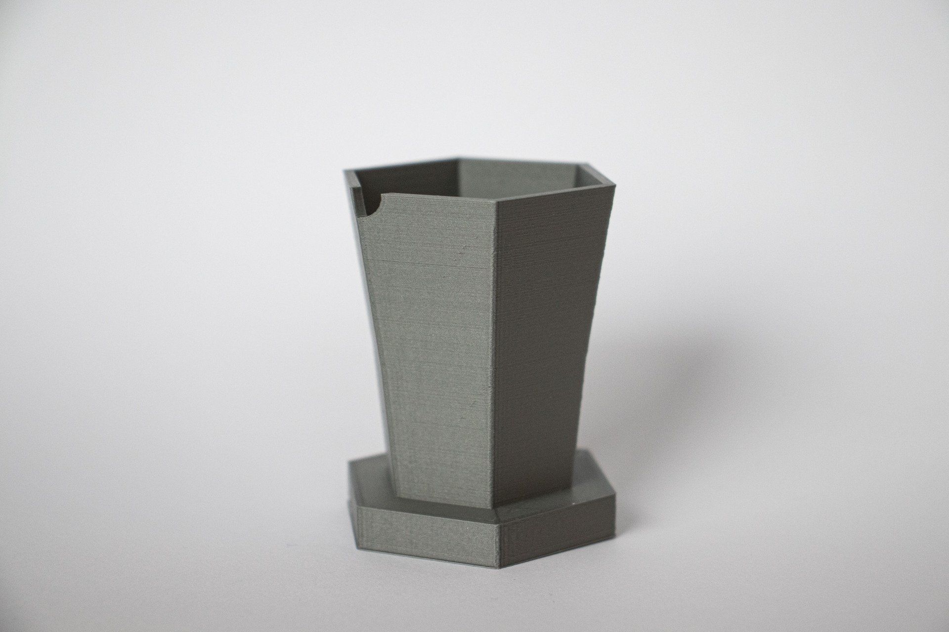
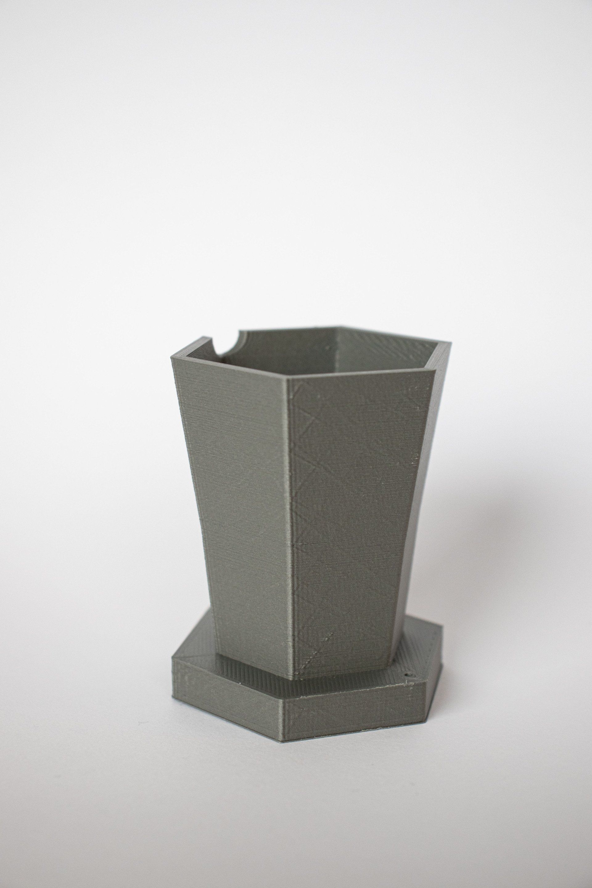
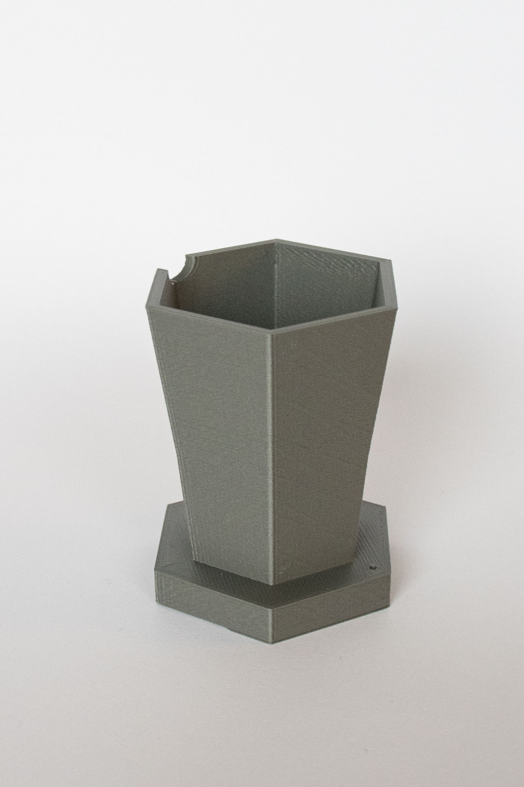
Green rain
For Intratuin, our team has crafted a flower box/rain barrel that filters water, allowing you to nourish your garden with purified water from above. This approach not only enhances your plants but also prevents water wastage.
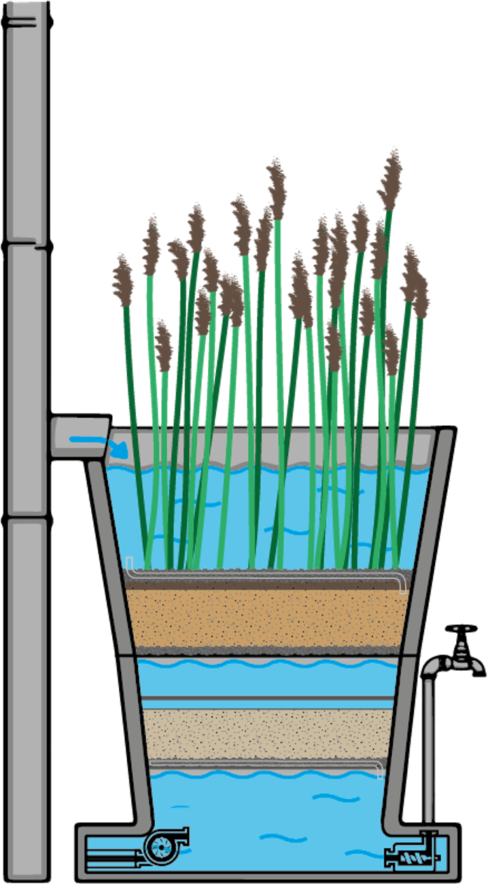
Our calculations indicate that the planter has the capacity to hold around 80 liters of water. We have endeavored to create this cross-section with meticulous technical detail; however, we cannot confirm its functionality as we have not had the opportunity to test it. Regardless, we are quite pleased with the outcome. Additionally, we have prepared working drawings that are included in our research book. Finally, we produced a 3D print of this design.
In this project, we explored the various plants that can effectively purify water. A selection of these plants is already known for their water-cleansing properties, including the Great Cattail, Mattenbies, Reed, and Yellow Iris. We conducted research to determine which of these plants would be the most appropriate for our planter. The aforementioned plants consistently supply oxygen to the bacteria responsible for water purification throughout the entire year.
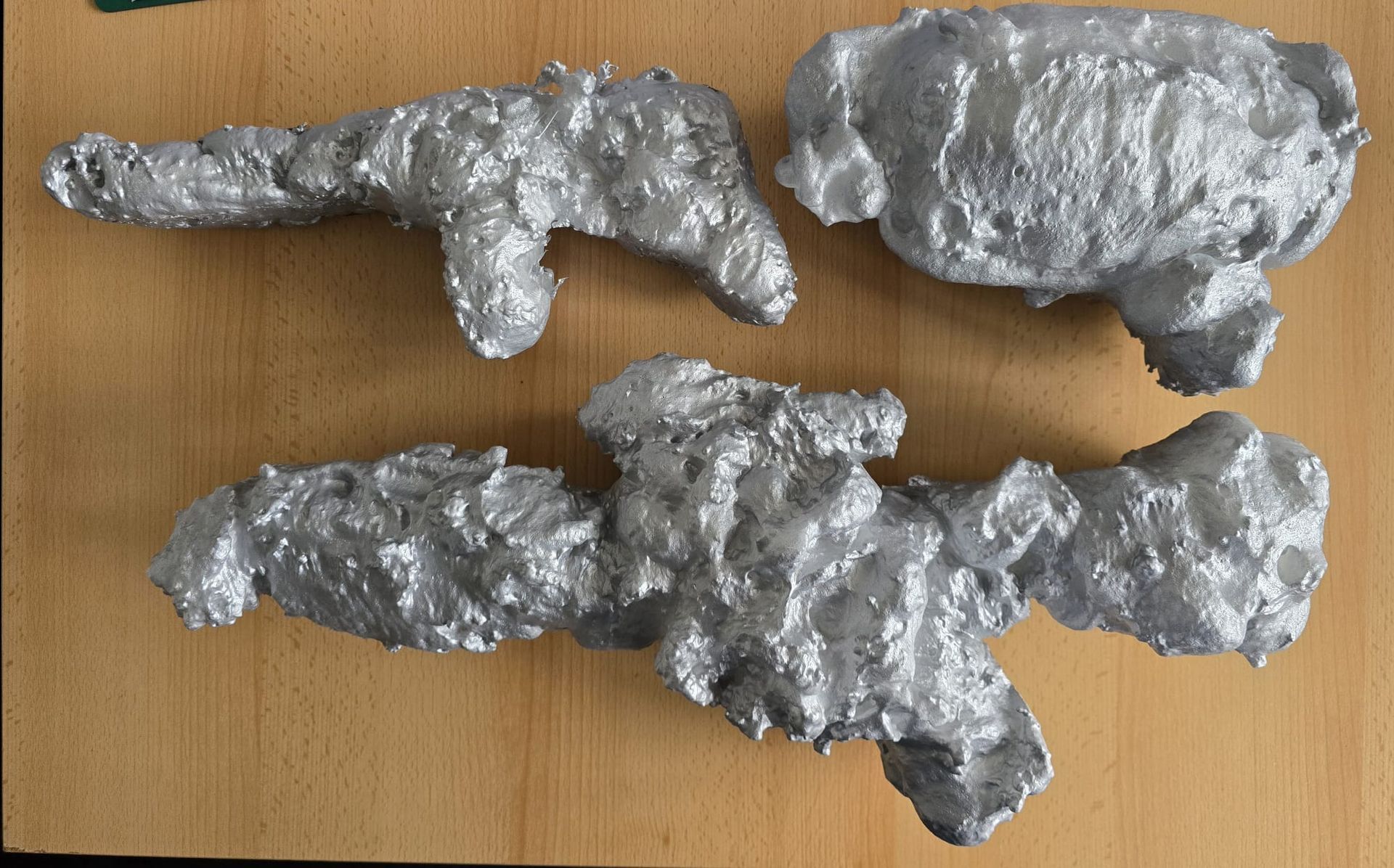
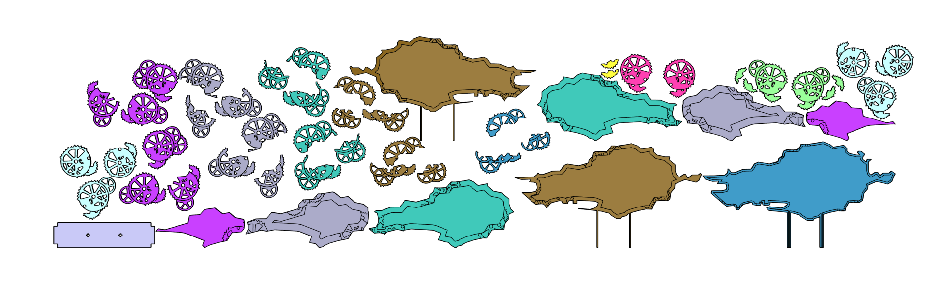
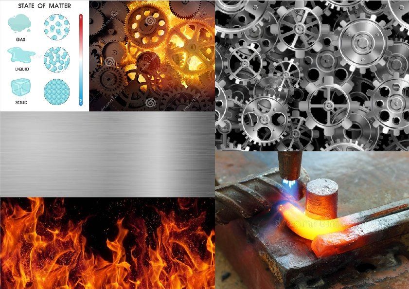
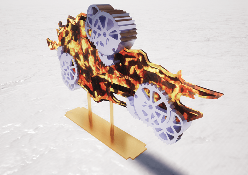
Fire % Metal
Is it fire or metal? Are they in conflict or harmony? These are the questions this art piece aims to provoke. Each material possesses distinct characteristics, which can be perceived both positively and negatively.
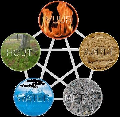
In traditional Chinese philosophy, five distinct elements are recognized. This classification serves as a framework for understanding all natural phenomena. The five elements find application in Feng Shui, astrology, traditional Chinese medicine, music, martial arts, and military strategies. Furthermore, these elements are linked to emotions, tastes, colors, organs, and cardinal directions. Each season is governed by a specific element, with late summer regarded by the Chinese as the fifth season, represented by Earth. In Japanese philosophy, the five elements are identified as Earth, Water, Fire, Wind, and Void.
The distinction between fire and metal lies in the fact that metal is both material and tangible, whereas fire eludes touch. Additionally, metal itself lacks mobility, yet when subjected to heat from fire, it transforms into a liquid state, gaining mobility. However, by shaping metal into a specific form, such as gears, movement can be achieved. This inspired me to create a coastal object that appears to be in motion, resembling a flame; and when contemplating fire, one realizes it only moves when connected to the functionality of gears in motion.

The Fire Animals are: Snake, Horse and Goat
Firework
The element Fire (red) represents summer. Fire is extrovert and likes to take charge, is ambitious and wants to make a change. Fire seeks power and takes many risks. Fire can make others enthusiastic about something, but it withdraws in the face of setbacks and then becomes disappointed. Fire is related to the planet Mars.
Positive aspects: passion, joy, passionate, dynamic, vital, enthusiastic, radiant, goal-oriented, decisive
Negative sides: blinding, volatile, tendency to arrogance, aggressive, selfishness, self-centered
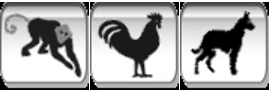
The Metal Animals are: Monkey, Rooster and Dog
Metal
The element Metal (white) represents autumn. Metal can concentrate well and sink into something. That gives Metaal an unyielding and resolute character. A Metal type wants the best and often stands up for people who are less fortunate or less fortunate. The goal of Metaal is to bring order to the world. Metal is independence and has its own opinion and point of view, which can lead to black and white thoughts. Metal is related to the planet Venus.
Positive aspects: perseverance, sense of duty, sense of responsibility, willingness to take risks, logical thinking, wisdom, striving for the best, communicative, social
Negative sides: tendency to hardness, sadness, melancholic, nostalgic
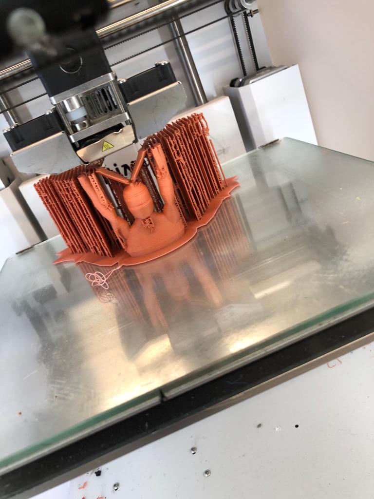
Statue of Liberty
A statue of a man with wings atop his head, these wings formed by white doves of peace, represents an international emblem and the embodiment of freedom and harmony. The man elevates them above his head as a cherished reward, for in this society, freedom is both invaluable and essential.
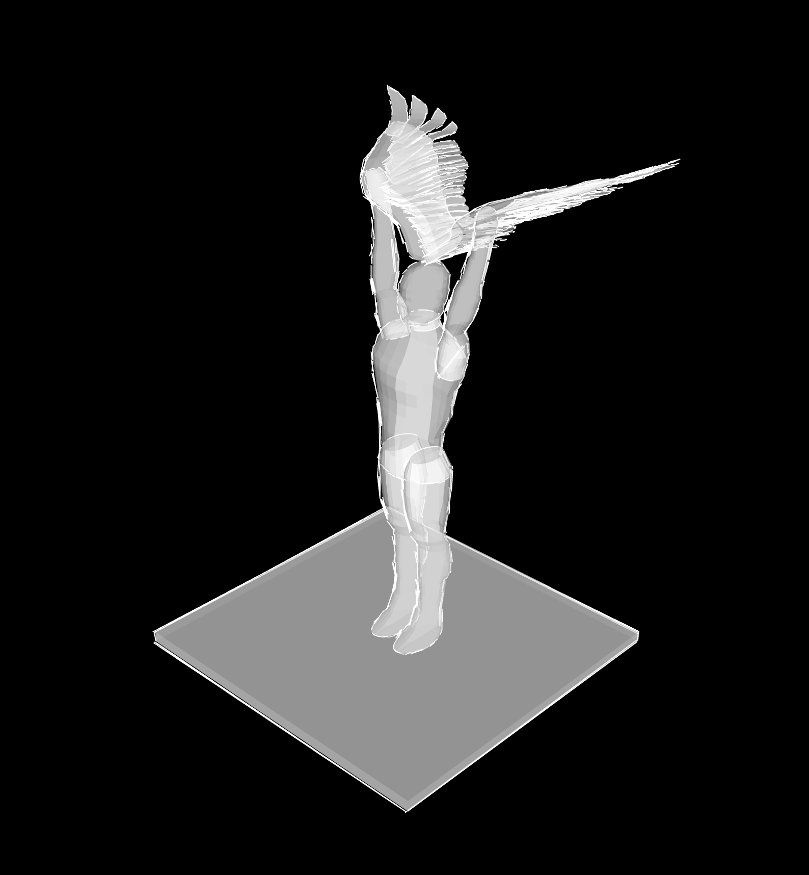
This image represents the freedom of expression, highlighting that every citizen can publicly share their opinions on any topic. However, this right does come with certain boundaries; it is, of course, unacceptable to incite hatred or to offend others without cause.
I believe it is crucial to emphasize freedom, and equally important that art captures this essence. Generally speaking, birds symbolize the elusive and the freedom that the soul yearns for. Freedom continues to be vital in our world, as there are always groups that grapple with feelings of oppression.
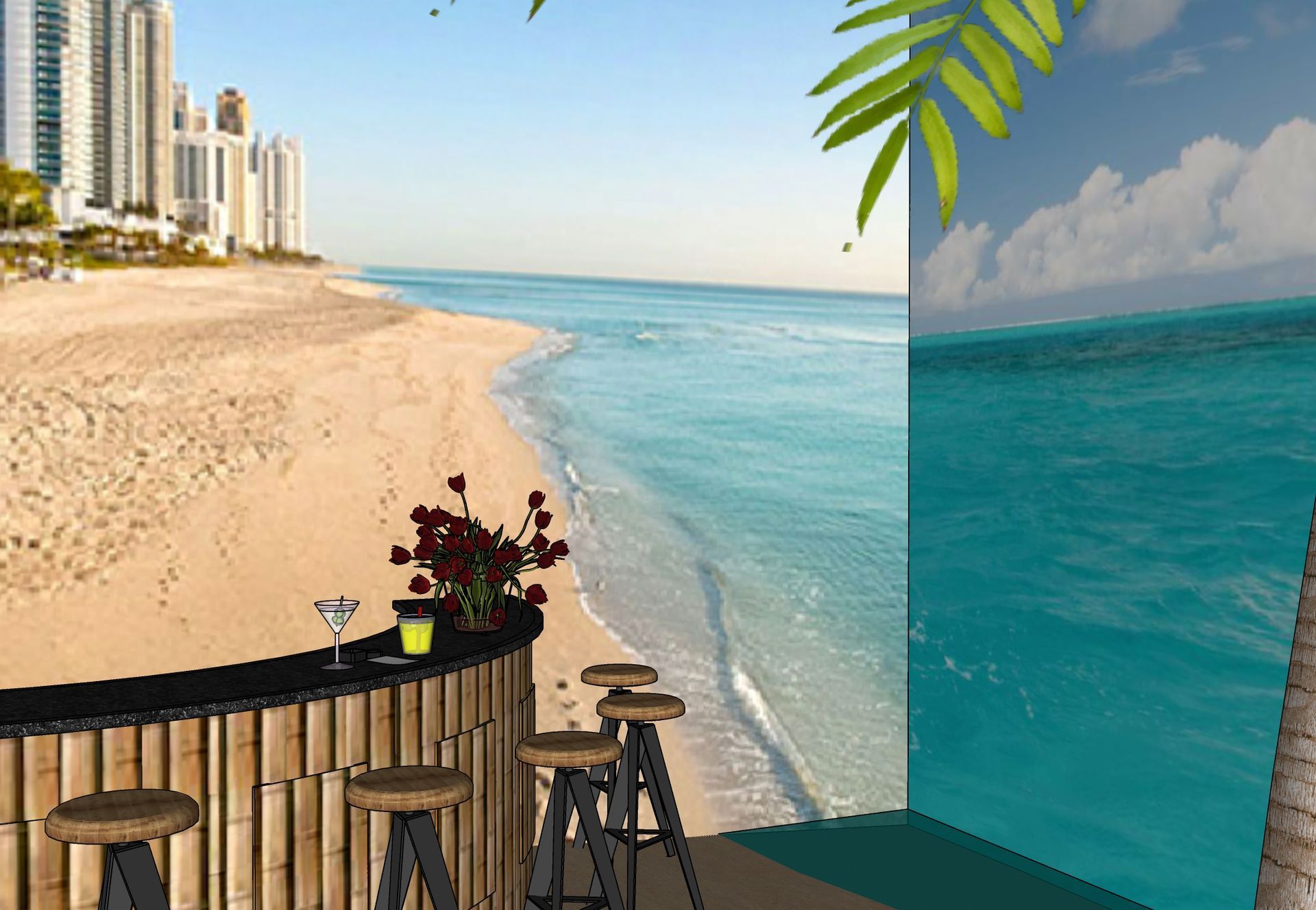
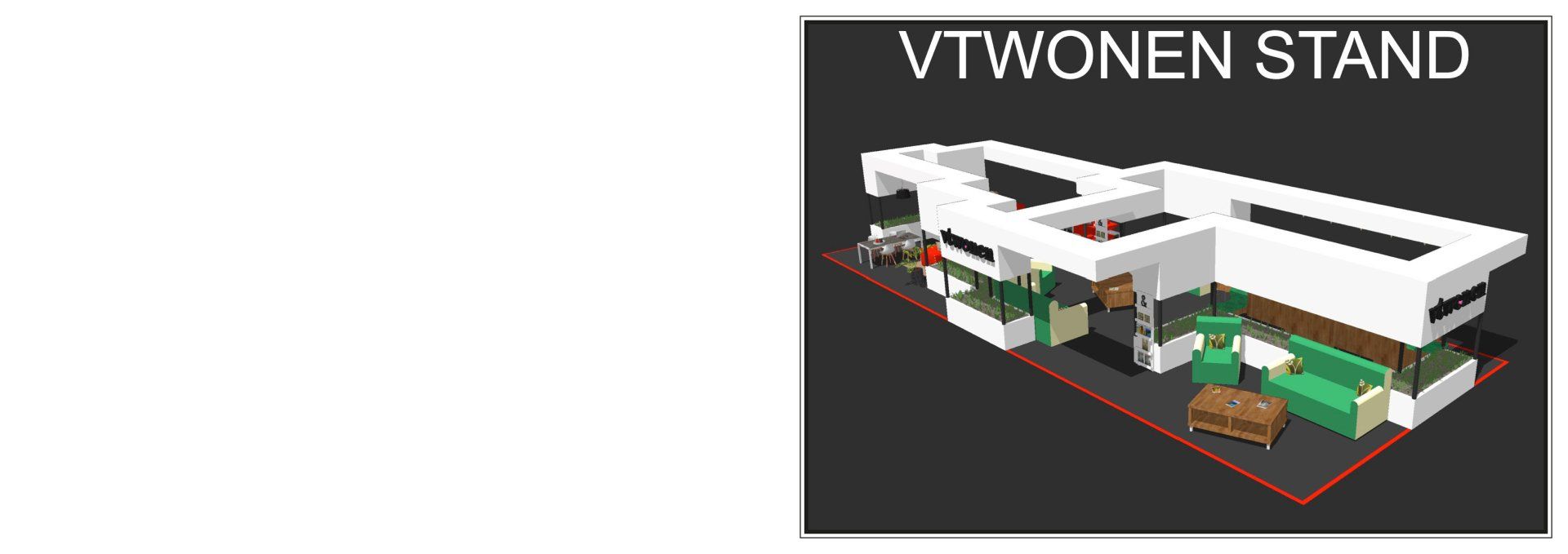
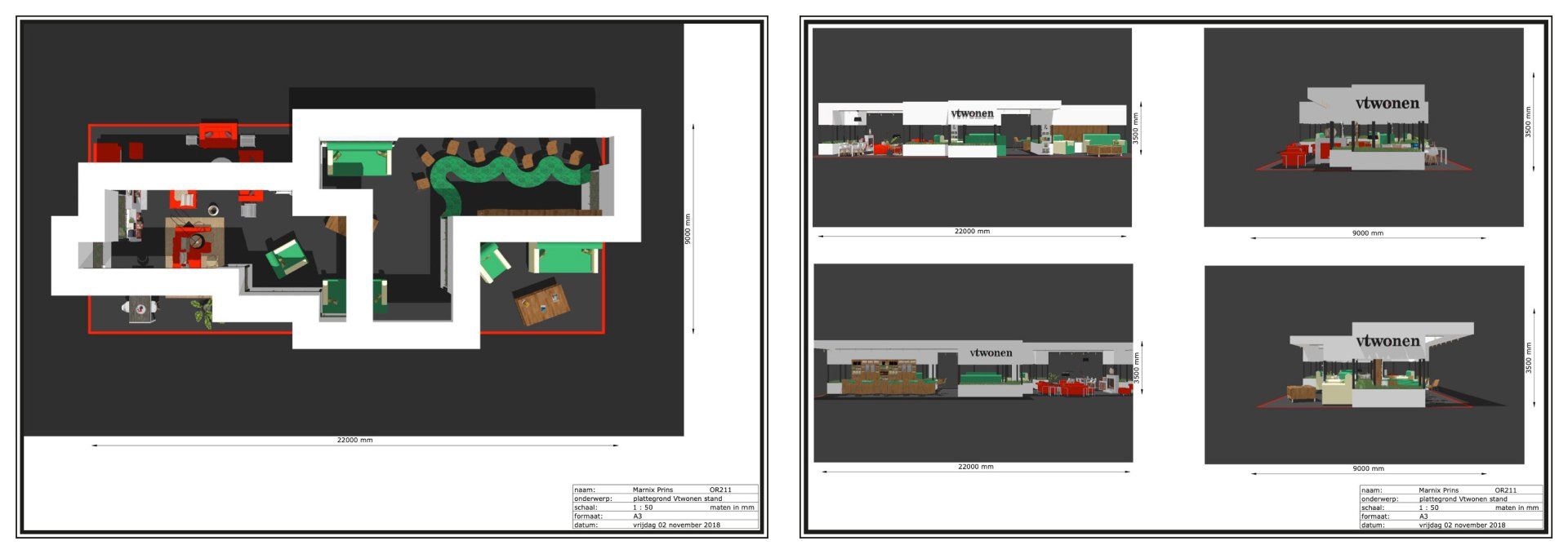
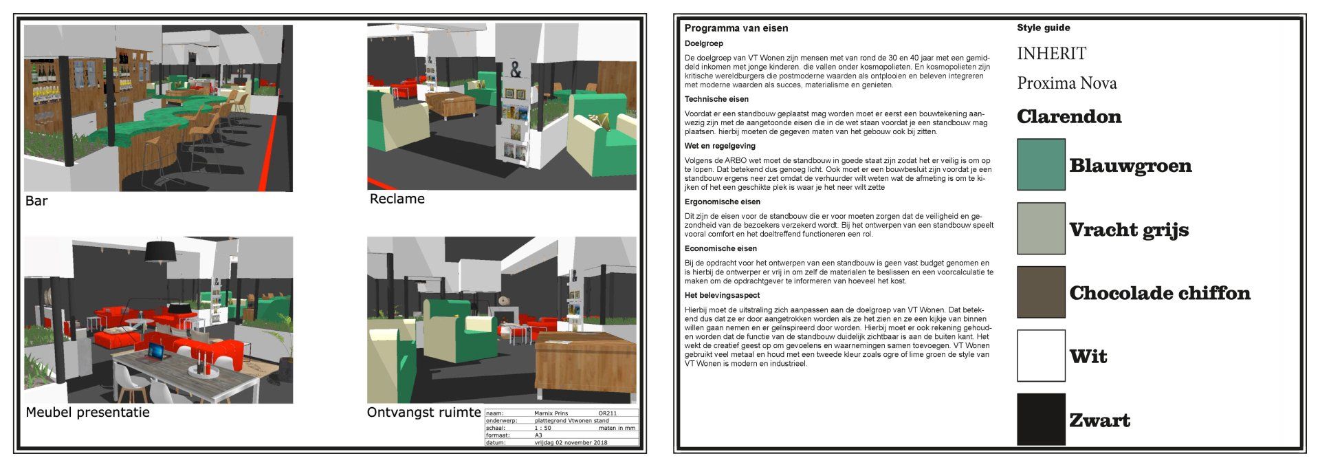
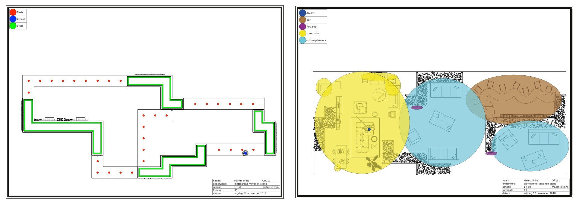
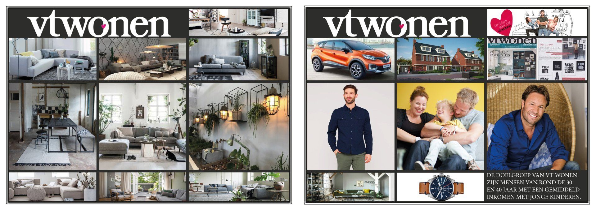
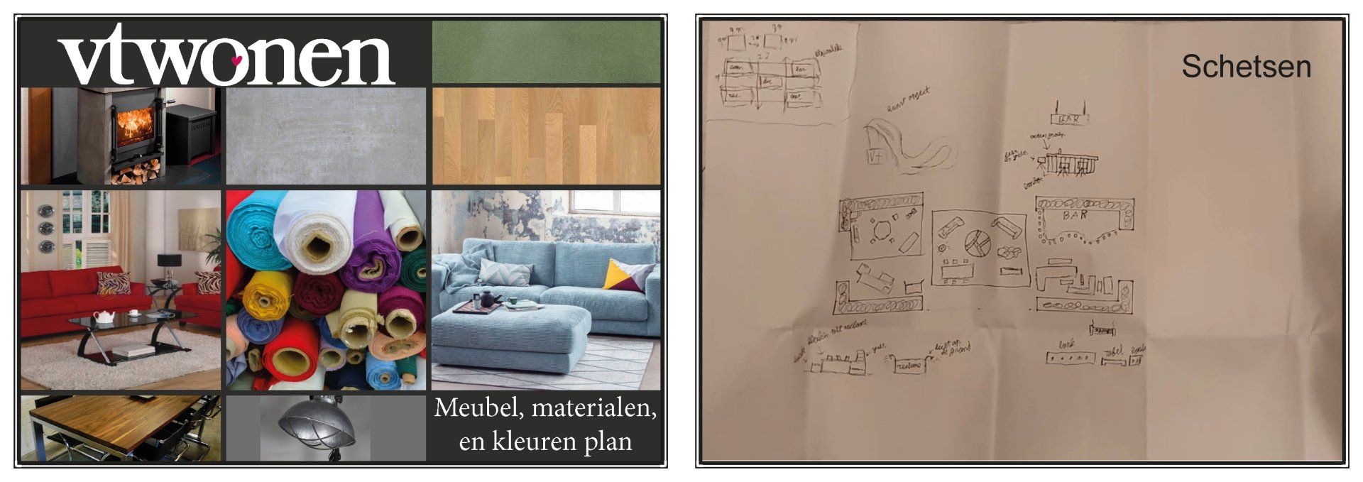
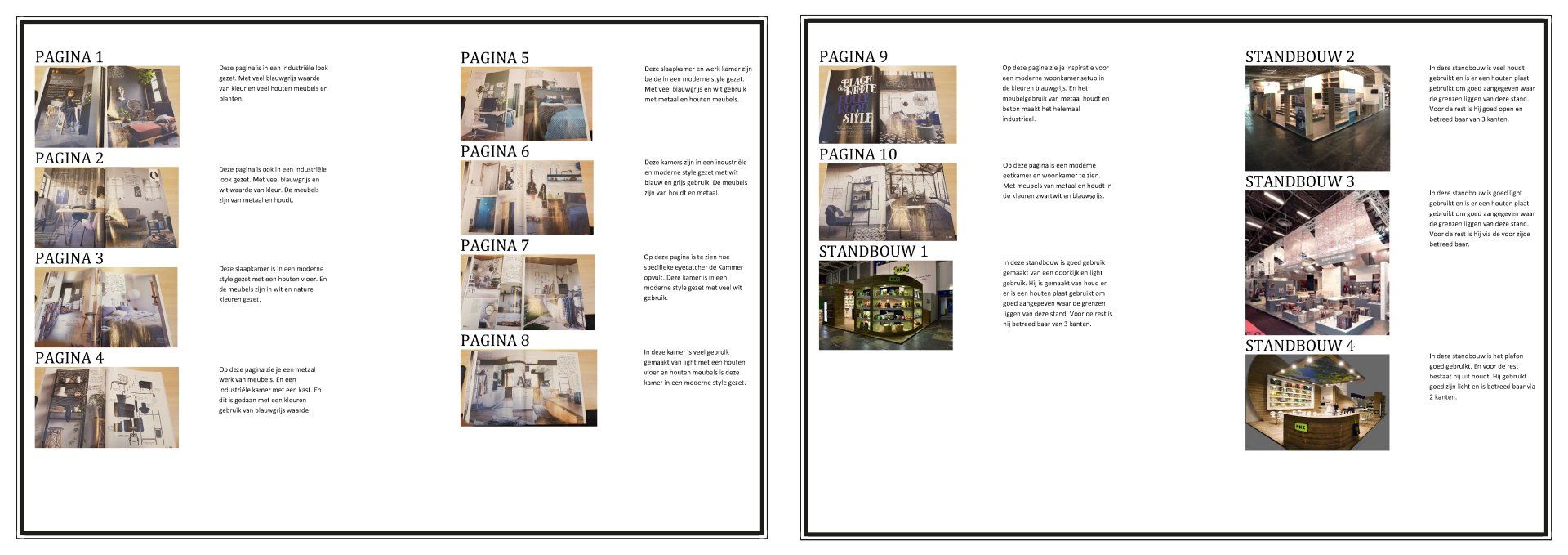
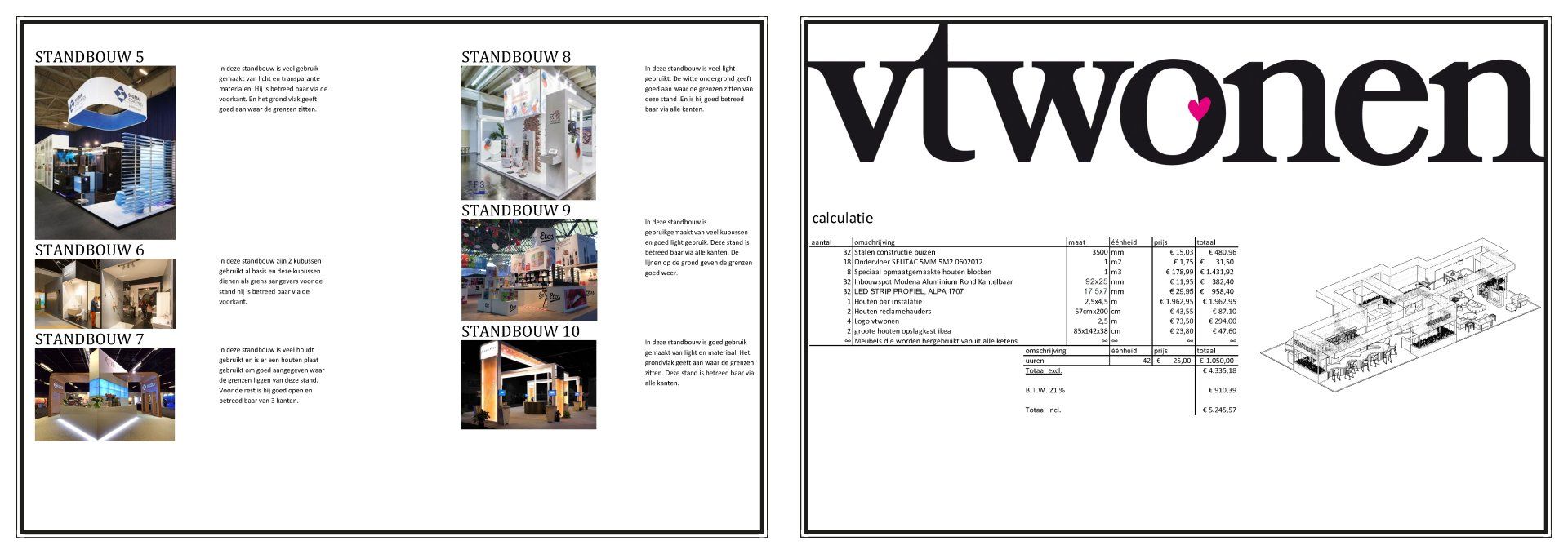
VT-Wonen
I crafted a stand for VT-Wonen that offers a space to enjoy a drink while appreciating their latest furniture collection. It was essential to incorporate the corporate identity of VT-Wonen.
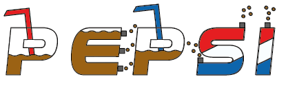
Pepsi
I created a stand for Pepsi that includes space for enjoying a drink and sampling the new flavors. Additionally, I developed a fresh design for the Pepsi logo and incorporated it onto the counter, which I also designed. I positioned it strategically to ensure that as people pass the counter, they are enticed by the sight of the new Pepsi flavor and encouraged to purchase it for a taste.
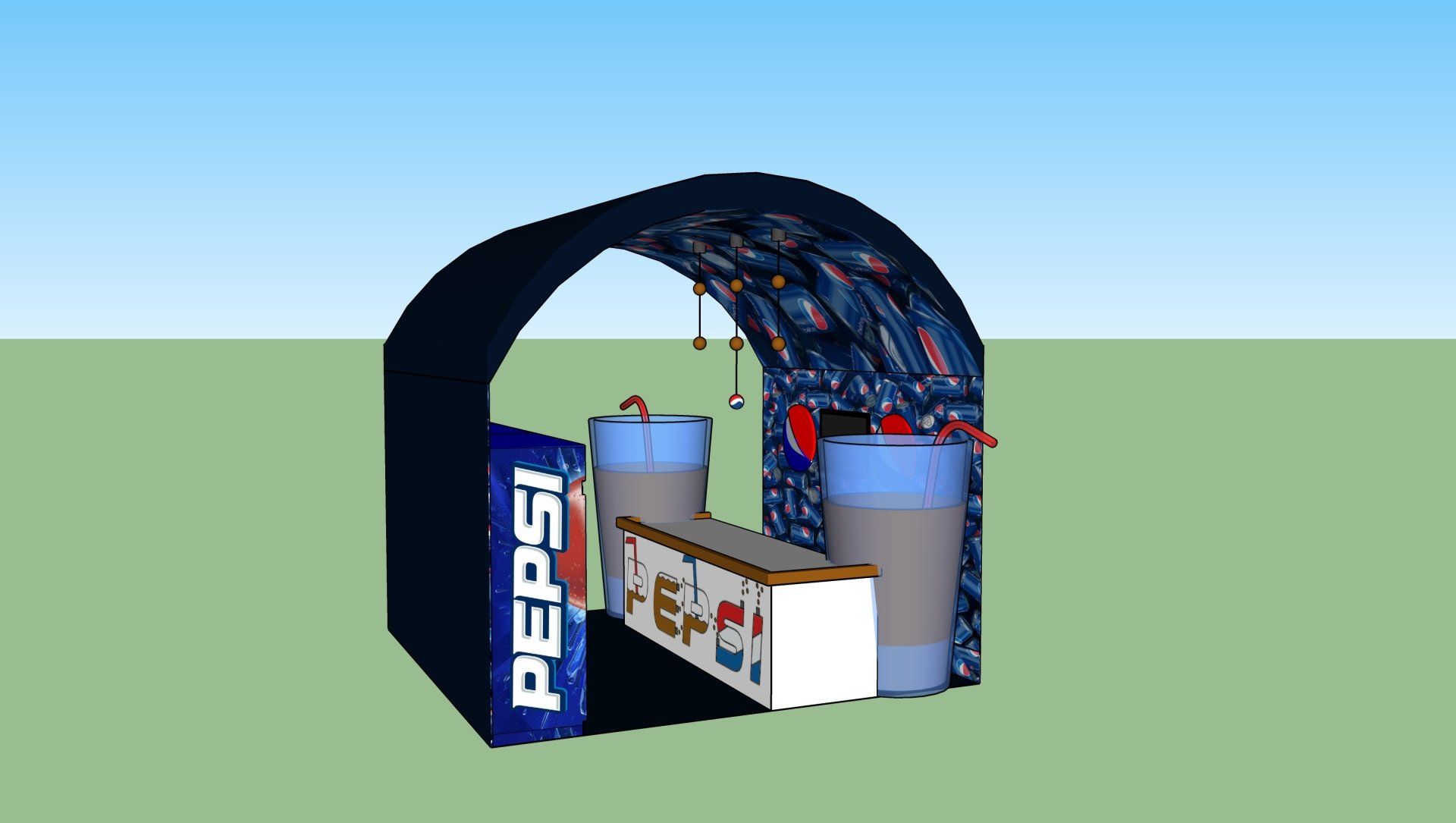
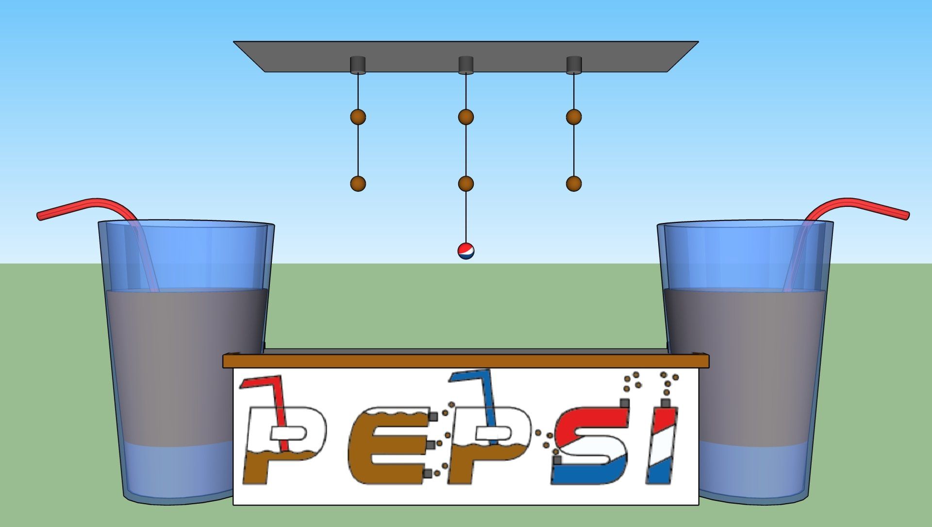
Pepsi primarily targets young individuals and students, as well as adults. It's essential to engage this audience effectively. Since they will encounter it frequently, the vibrant use of color captures their attention, encouraging them to make a purchase.